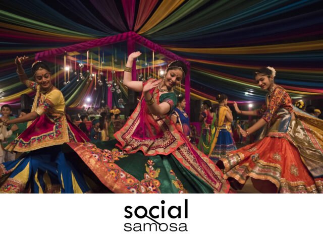
On the eighth day of Navratri, we explore the versatile nature of the colour pink in marketing, from its traditional associations with femininity and nurturing to its modern roles in conveying empowerment, creativity, and approachability across various industries and brands.
We are celebrating the eighth day of Navratri, where the colour pink reigns, symbolising love, compassion, and nurturing, each quality celebrated by Goddess Mahagauri. Wearing pink on this day is supposed to embody openness to love and kindness, bringing a calming effect and a sense of peace. But beyond this festive significance, the colour also holds a powerful place in the world of marketing, where its versatility goes beyond stereotypes. In this piece, we look at whether using colour in brand logos and messaging has succeeded in making brands seem approachable.
A colour, defying boundaries
Pink has a fascinating history in colour psychology. Traditionally, pink was associated with boys due to its proximity to red, which symbolises strength and power. Meanwhile, blue was the colour of the Virgin Mary, seen as delicate and feminine. However, in the mid-20th century, pink underwent a transformation largely driven by fashion and social trends. It went on to become associated with femininity, sweetness, and calmness.
According to reports, by the 1890s and the early 20th century, manufacturers attempted to sell more children’s and infants’ clothes by colour-coding them, eventually associating pink as a colour for girls. After World War II, as society wanted to restore ‘traditional’ gender roles, bright, cheerful colours like pink were assigned to women and children, representing a return to domesticity after women’s wartime contributions in the workforce.
The color started being used in women’s fashion, cosmetics, and advertising, with brands like Dove utilising it in their messaging and products.
In modern branding, however, pink’s meaning has expanded far beyond its stereotypical associations. Today, pink represents a diverse range of emotions, including fun, sophistication, strength, rebellion, love and flirtation. The ability of pink to evoke contrasting qualities for different brands is one of the reasons why it’s such a powerful and versatile colour for brands.
Repurposing pink in branding
Talking about the purpose of the color in branding, Kunal Vora, Founder-Partner, ABND notes, “Pink doesn’t just sit pretty – it connects. It’s like comfort food for the eyes. So, when a brand chooses pink, it’s creating this emotional buffer, making things feel more approachable, more human.” Perhaps this is why the brand Mattel used the colour for its product Barbie to connect with children.
In its lightest tones, pink symbolises fun, playfulness, and innocence. Mattel’s Barbie has long been associated with vibrant pink hues, representing femininity and confidence for decades. Despite the negative connotations of the colour being deemed as too delicate and enforcing unhealthy beauty standards for women, the release of the 2023 Barbie movie helped the brand reinvent itself. In 2023, as ‘Barbiecore’ took over with fashion pieces to brand collaborations including the colour to resonate with modern women, Mattel managed to reclaim the signature pink, symbolising Barbie as not only a children’s toy but also empowering.
Vora continues, “What’s fascinating is how pink has evolved. It’s become a symbol of empowerment and inclusivity, and brands that use it are often those willing to flip the script. It tells the consumer, ‘We see you, we are different, and we are not here to play by the old rules’.”
Pink now plays a central role in the evolution of many brands, showcasing how colours can be interpreted to engage different audiences. Brands leverage pink’s youthful energy, feminine associations, and sophisticated tones to tap into a wide spectrum of consumer emotions.
In QSRs, brands like Dunkin’ Donuts use mid-tones of pink to project a fun, energetic image. These brands leverage pink’s vibrant energy to evoke excitement and approachability to stand out in crowded markets.
On the other hand, darker shades of pink can be interpreted as sophistication and calmness. Adobe XD, part of Adobe’s suite of design tools, uses a darker, muted pink in its logo to reflect creativity and innovation. This subtle use of pink enables Adobe to appeal to professional designers while standing apart from competitors that use more traditional colour schemes.
Originally Published:
Social Samosa: https://www.socialsamosa.com/experts-speak/navratri-colours-versatile-role-pink-marketing-7304644


