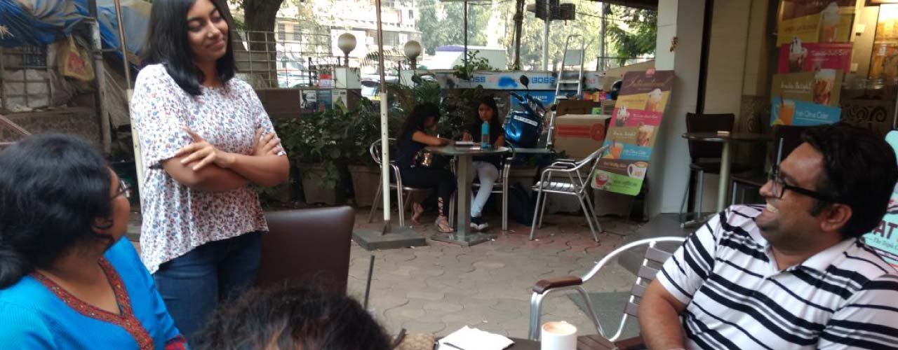
Spread over 15 acres of farm is a place nestled in the hills of Karjat, where artists of all fields come together to invent, create and share their philosophies and methods of practice. The art of pottery making, earth building, papermaking, painting, droning etc. are taught and learnt at this art center. This is done through various workshops, documentary screenings, festivals, talks and performances. Whether it is someone focused on learning these art forms or a person looking at a relaxing weekend retreat, this place offers a space for both creative endeavours and rejuvenating zeal.
India’s first earth built art center cannot be projected as just a resort, a gallery or a workshop. Then how does one go about branding it?
ABND joined hands with India’s first earth built earth center from its very inception. It was like a home project for us, being involved on site to piece out all the bricks. The main branding challenge was that we couldn’t get around projecting it as a workshop, a resort or an art gallery so it was difficult to capture the essence of the entire place in one name. The center started off as an artist’s movement with festivals where craftsmen would meet to discuss their learnings. We helped them build the business model and streamline their goals.
To build the identity of India’s first earth built art center, two elements had to be brought together - one representing earth and another representing art. An effective and conflict-free name was given to the project - Art Village. Since the project was founded by artists and architects and the workshops conducted were all to do with teaching an art or craft, the word ‘art’ had to be emphasized. The term ‘village’ helped in capturing the expanse of the project and assigned the brand a ‘community’ feeling. Also, the fact that earthen huts dotted the entire campus did indeed give the place the feel of getting back to nature, represented best by the rural space. Calling it a ‘village’ made aesthetic sense.

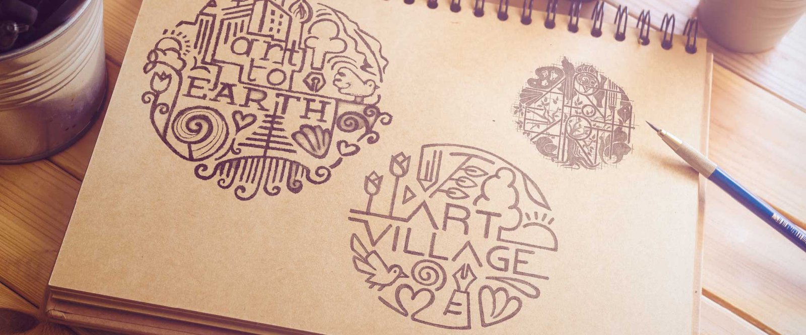
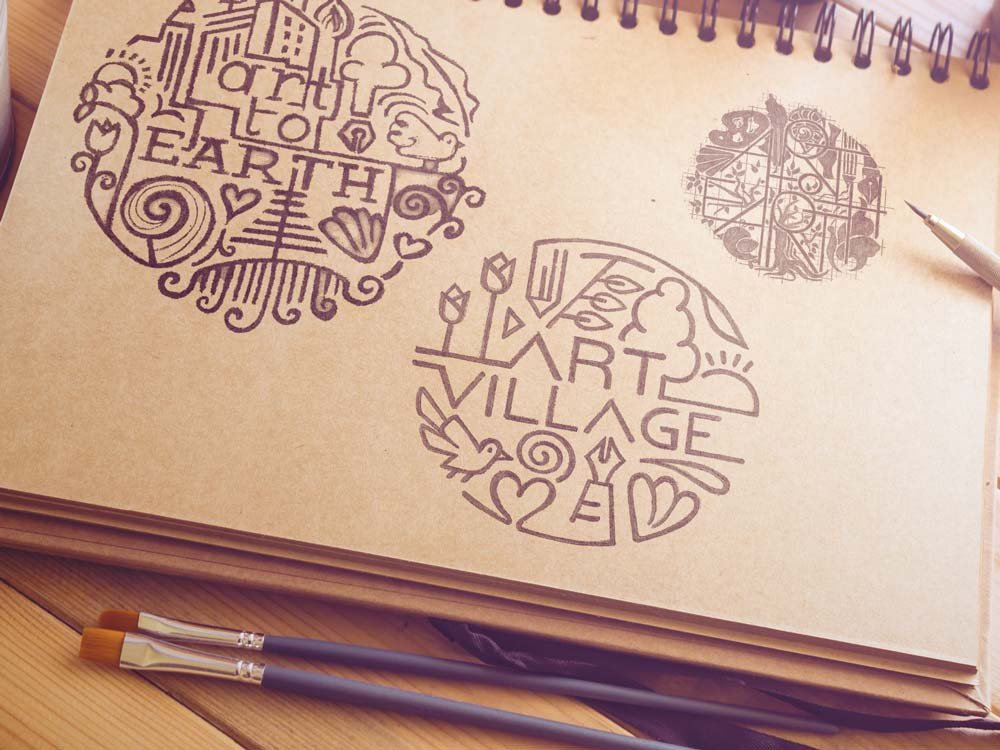
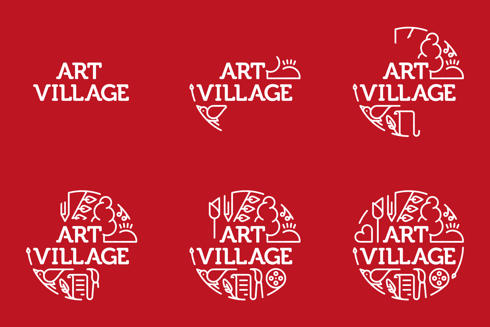
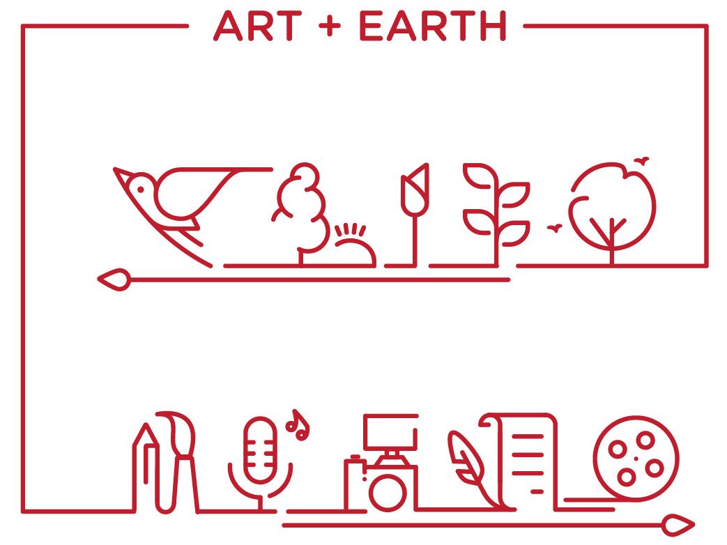
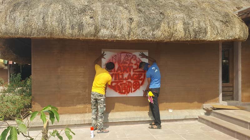
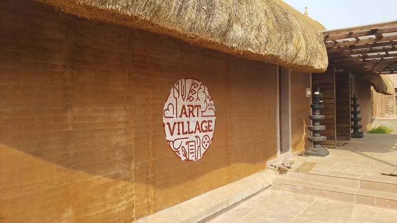
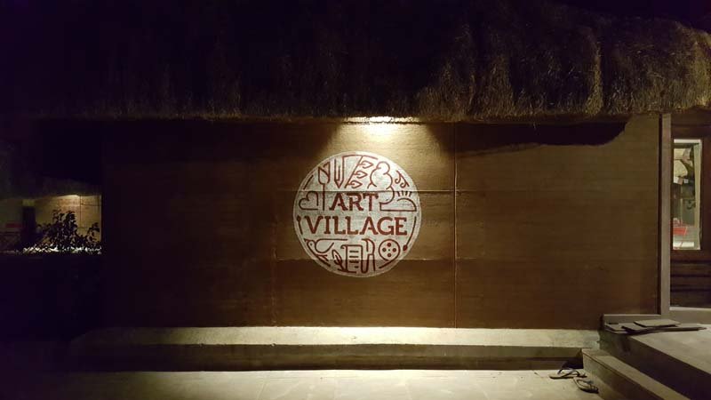
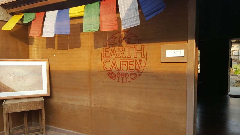
As we wished to represent elements of nature and art in the symbol of the logo, we thought of circumscribing such elements in a sphere to bring out the fact that Art Village represents the best of nature and art on earth. In the symbol, the sphere of Earth holds tiny rounded icons of birds, leaves, clouds and sun on one hand and the film reel, paintbrush, quill and written paper on the other. The typography matches the logo style in having the edges of the letters rounded to suit the overall visual identity of the brand.
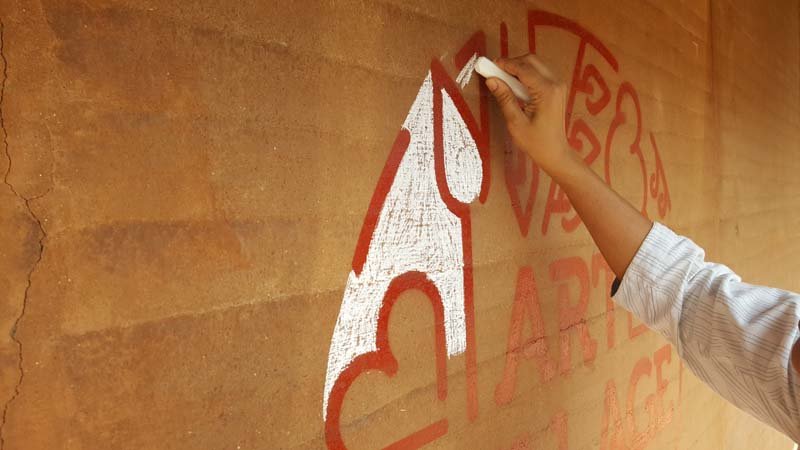
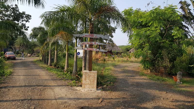
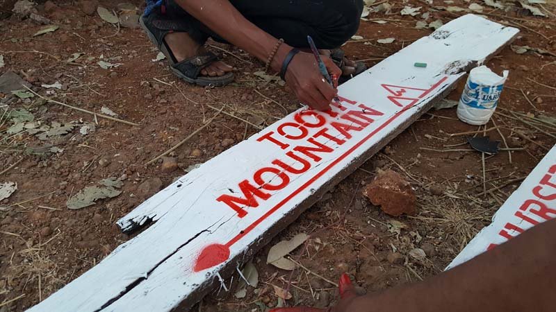
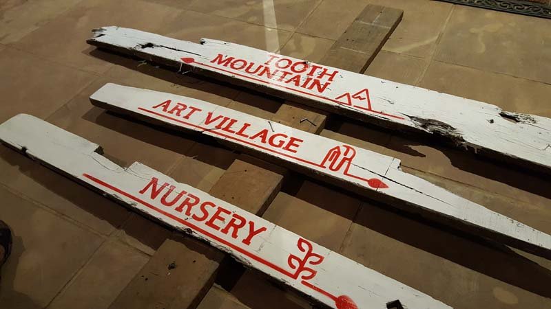
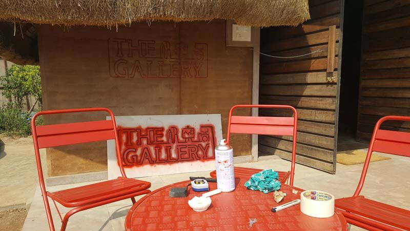
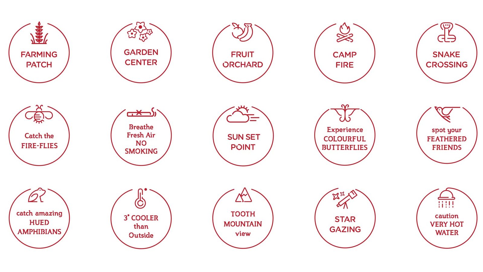
ABND took up the task to design all external and internal communication for Art Village. All the workshop and master class advertisements, brochures, schedules and posts were created. The signages were made in tandem with the visual identity of the brand, in rounded fragmented lines, with sustainable material that was intrinsic to the place like the remnants from workshops- clay, wood, chalk etc. We helped in installing the signages on site and worded it wittily, with imagerial indicators. Thus the bird watching zone was named “Spot your feathered friends” and the firefly nook was termed “Catch the fireflies.”




Positioning, Brand Name, Brand Identity, Communication

