ORYZA
Positioning, Brand Identity, Packaging
Alembic Pharmaceuticals, one of Asia’s leading in the pursuit of health and welfare, wanted to create a skin moisturizer that was one of a kind. Oryza Moisturizer is a steroid free ceramide dominant cream with a 3:1:1 ratio formula of ceramide, fatty acids and cholesterol, mimicking the composition naturally found in the skin. Alembic was the first to go ahead with this composition in India. It could be used by patients of all ages with no restrictions.
ABND was tasked with positioning and developing the brand identity of this skin moisturizer that dermatologically recommended. The product had to be made relevant not just to patients but also people conscious of keeping their skin healthy and moist.
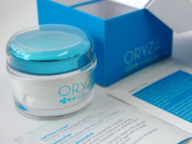
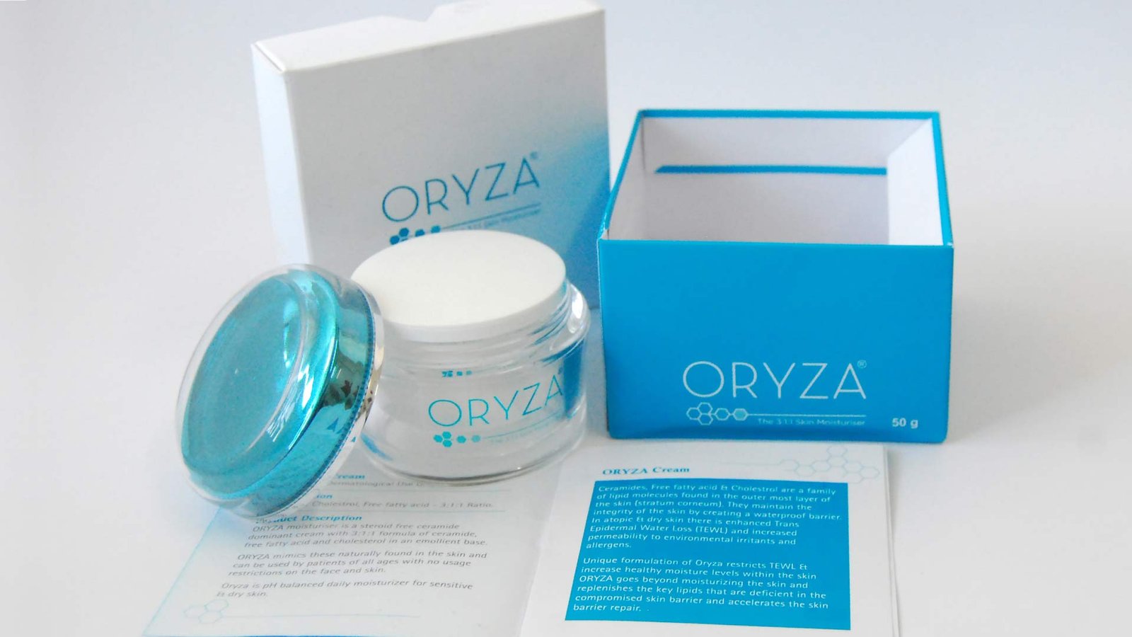
Taking a cue from the main USP’s of the brand, it was positioned as “The 3:1:1 Skin moisturizer” revitalizing the skin with ceramide, cholesterol and fatty acids in the proportion stated. To foster a word of mouth popularity we positioned ‘Oryza’ as a moisturizer and an OTC drug. We went ahead with the minimalist representation of using skin cells in the logo to incorporate the feeling of a product belonging to the pharmaceutical category. Blue and white are the colours we played with, the usual in this category, but with a distinct streak of turquoise blue that helped us stand out. The lid of the box had a sleek cut and sharp edges. The container of the moisturizer had a transparent thick covering all over to make to add volume to the container and make it look attractive. An instruction manual inside the box ensured again the seriousness of considering Oryza as clinically prescribed.
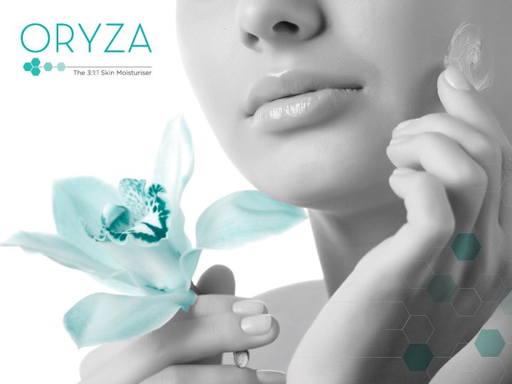
A steroid free moisturizer that replicates the composition of your skin


Positioning, Brand Identity, Packaging
