GRAB
Brand Name, Rebranding, Positioning, Brand Identity, Communication, UX-UI
Grab-A-Grub, the last leg of the delivery network that ensures a strong logistics support, partnered with ABND and we worked towards establishing a new business model amongst their now, new customer base. The challenge was twofold; to shift the perception the market had of Grab-A-Grub from just food to an all-encompassing hyper-local and last-mile delivery service and to change a name which was already established in the space of food deliveries, considering their expansion.
Taking these challenges into consideration, ABND found that during the process of rebranding, changing the name ‘Grab-A-Grub’ to something completely different would be far from ideal and result in the company losing its brand equity and market recognition. While conducting market research we realized that most customers colloquially called the company “Grab”, instead of Grab-a-Grub. We decided to simply change the name to Grab instead of something that would detach the user from past familiarity. This new brand name was simple, catchy and lent itself to instant recall.
How chopping a Name helped create a Sharper & Agile Brand?
Under the new business model, Grab would operate as a service for the merchant and not the customer. The branding objective was to project Grab as a last-mile delivery service, not just for restaurants, but also for pharmacies, grocers, e-commerce companies and any business that required such a service.
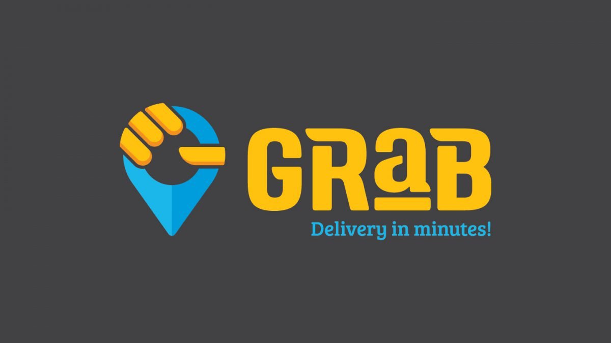
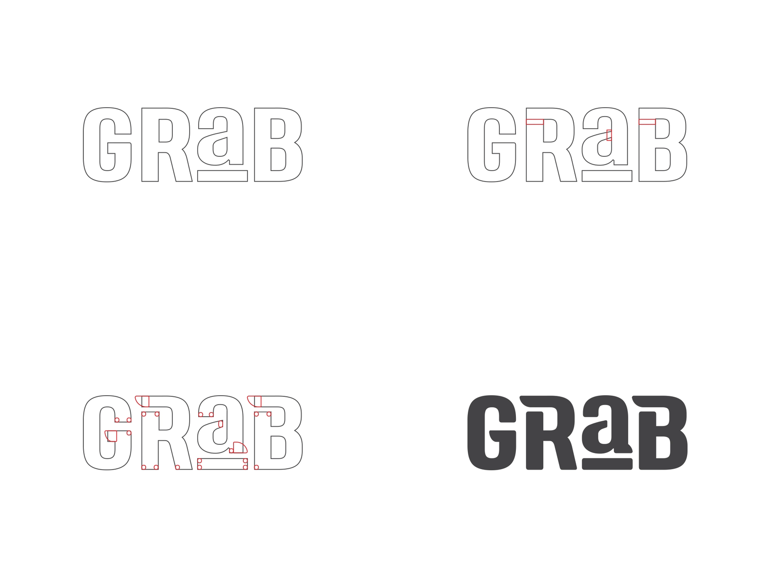
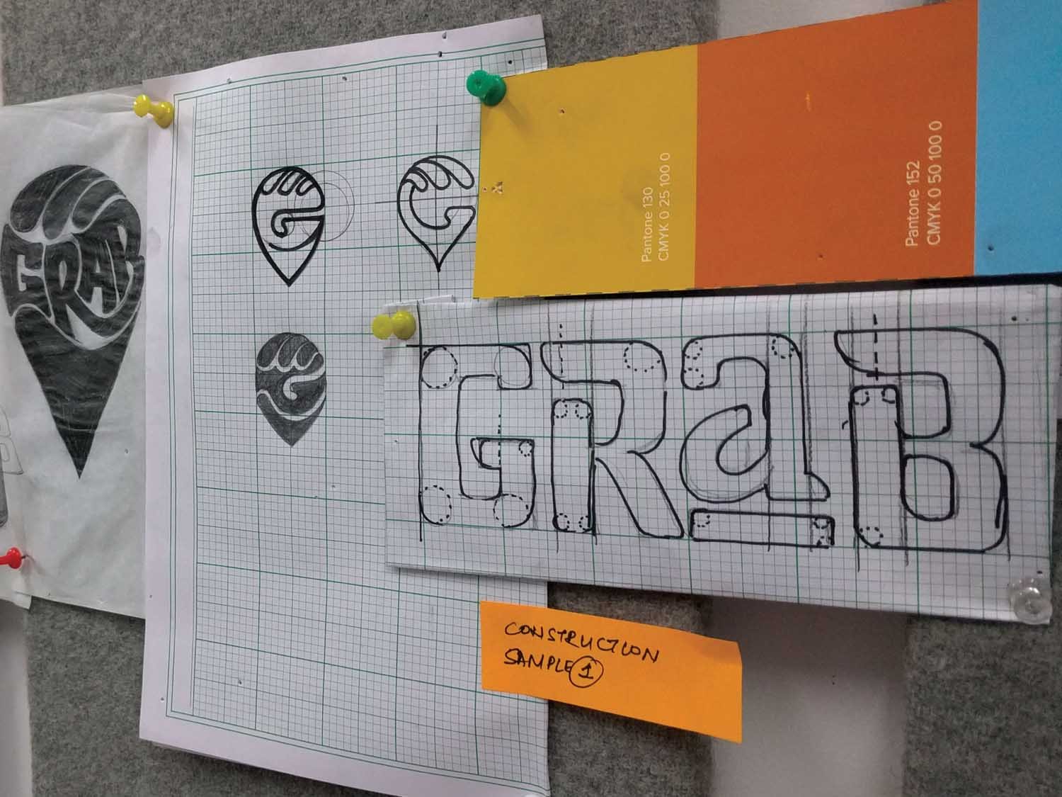
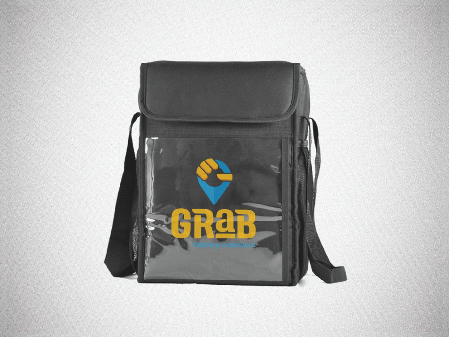
The logo needed to be youthful, fresh and easy to understand. It stemmed from the idea of a hand grabbing a geo marker. We further developed a custom typeface that accompanied and matched the symbol. Overall, its uniqueness and visual impact are what make it memorable. The tagline “delivery in minutes!” was introduced to further highlight last-mile delivery as well as differentiate it from conventional logistics companies.
We had to ensure that the right message was going to the target group in focus. For instance, the message targeted to E-commerce clients couldn’t be the same as that communicated to restaurants. So, we had to develop different communication material for the different clientele that Grab now catered to.
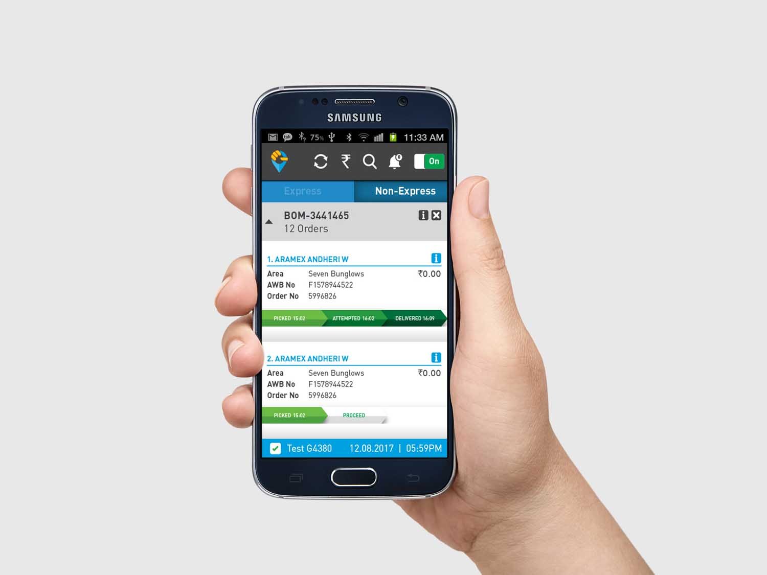
ABND also developed and designed Grab’s website with a user-friendly interface, an easy content management system and a design style that was in sync with the new brand identity. In addition to this, we also developed two mobile applications for Grab, the rider app and the merchant app. We’re also in the process of developing yet another application for the end-consumer to use as well.
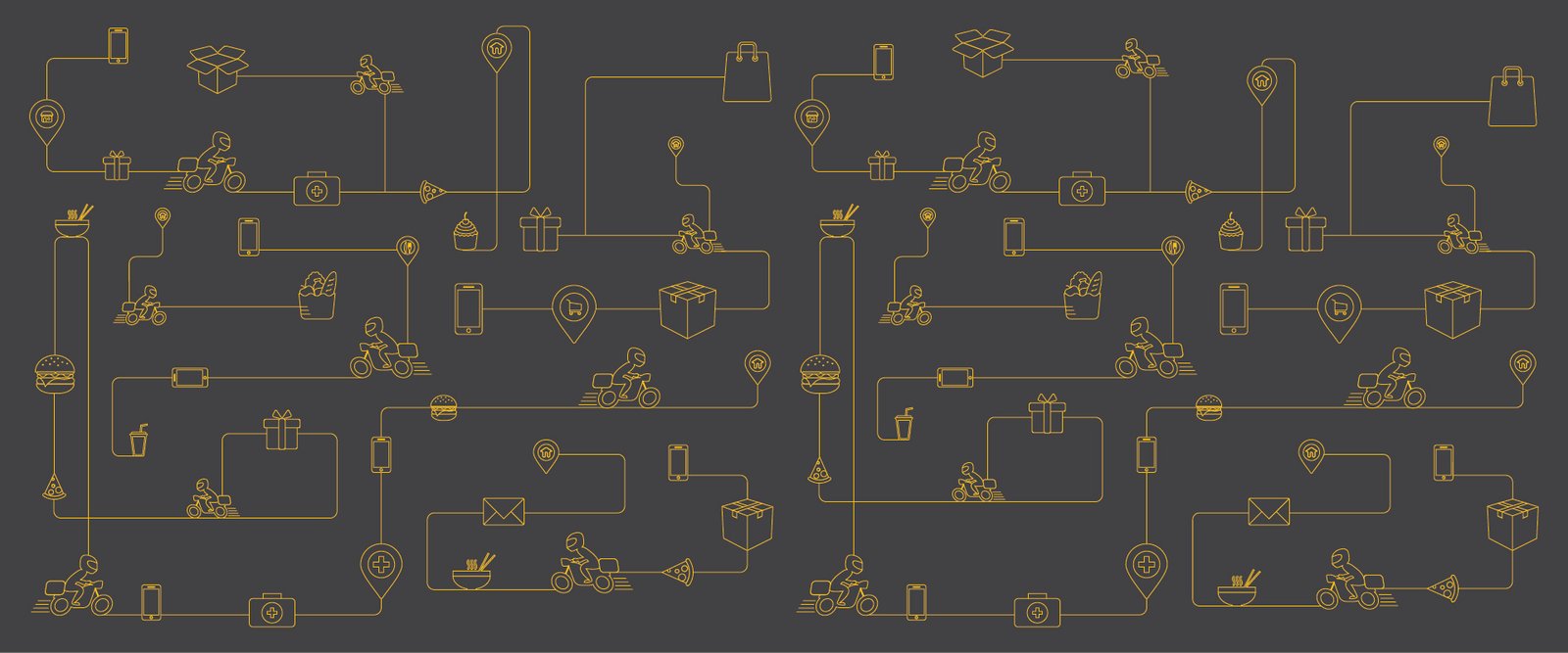
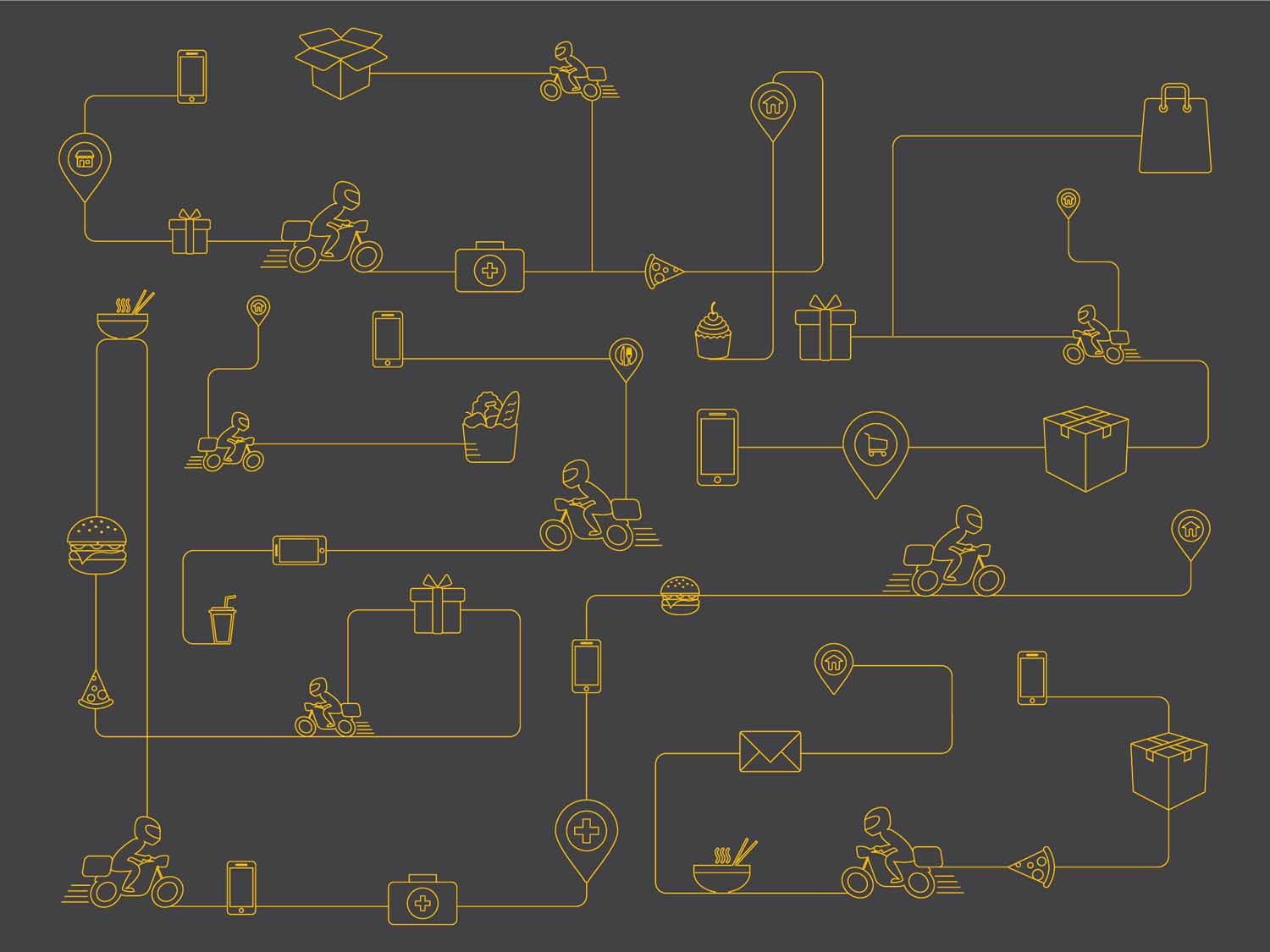
ABND also designed simple information graphics that illustrated the process and workings of the business. This was used by Grab for recruitment purposes and HR activities, that was also sent out to the merchants for easy understanding.
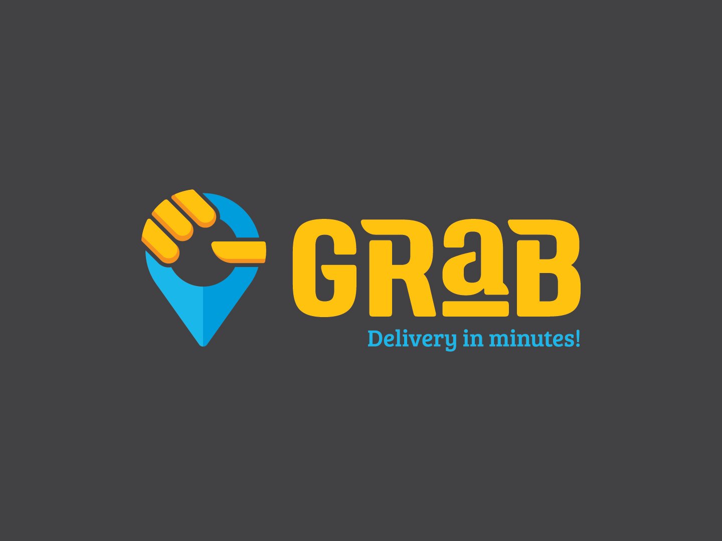
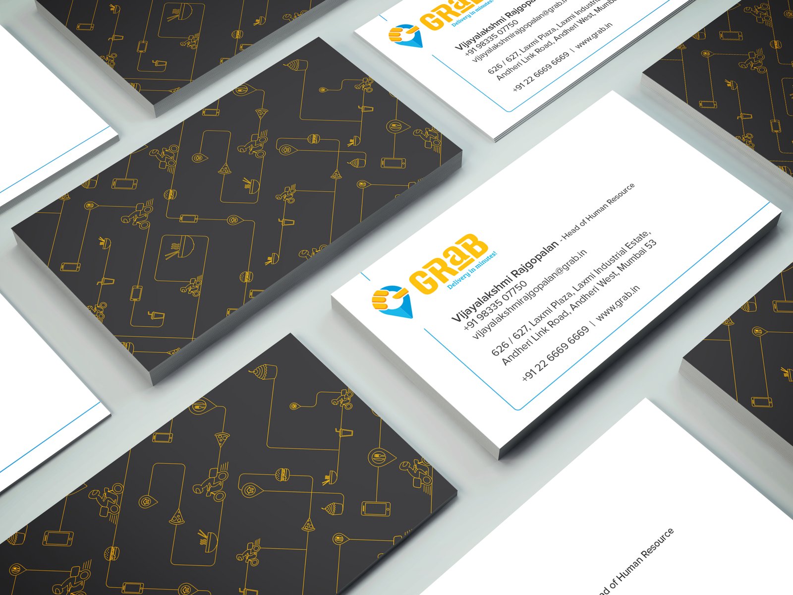
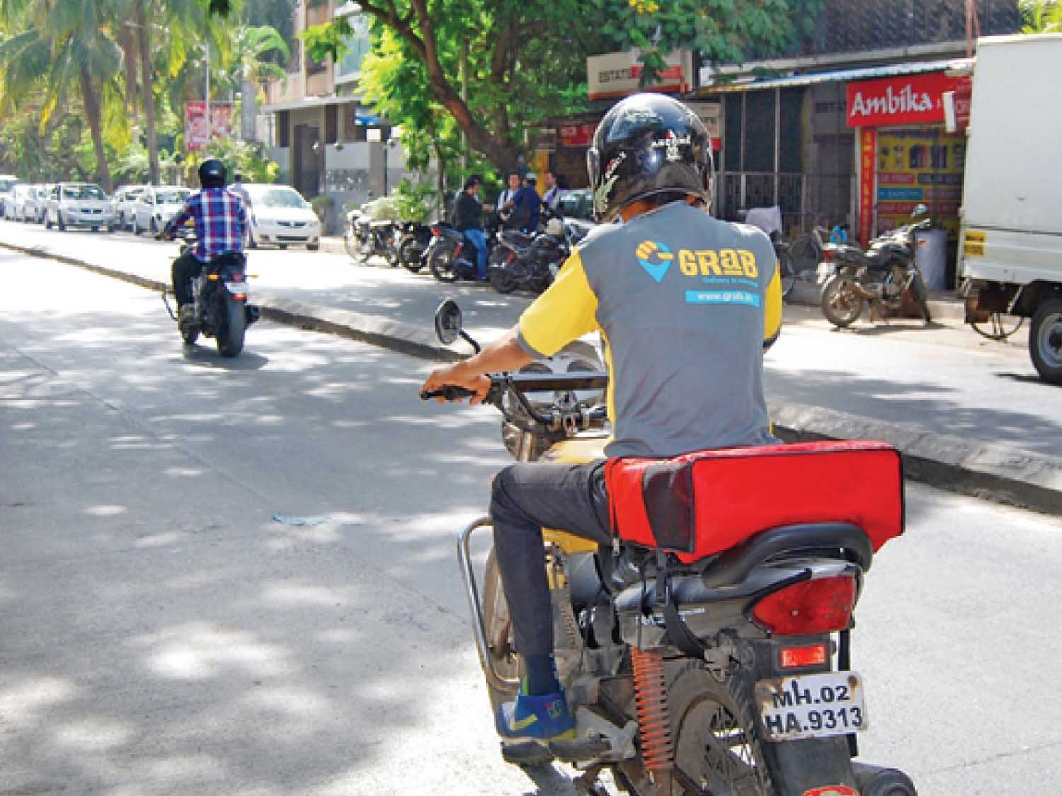
Grab was still a start up in a market unfamiliar with an operating model of this nature. This meant that the communication frequency would be a little low. To counteract this, it was imperative that the design be visually clear and highly impactful. The visual style we developed showcased what the business stood for – everything we developed from the icons to geo markers, were used to depict the nature of the business. This new visual identity was then used across all communication material.

Brand Name, Rebranding, Positioning, Brand Identity, Communication, UX-UI
