BIRLA INTERNATIONAL SCHOOL
Brand Concept, Brand Identity
We needed to create a brand for two Birla Group schools – Ashok Birla International School and Sunanda Birla International School. Although both these schools were independent, the objective was to create a visual identity that connected them to each other, as they belonged to the same parent brand.
Connecting the Identities of Two Schools


The Visual Identity
Using this concept of “Organic Education”, the visual identity of the Schools is composed of elements that stem from a triangle-shaped building block showcasing the dynamic dichotomy of agility amid stability. The logo has fluid leaf graphics within this triangle forming an ‘S’ and ‘A’ for both schools respectively, the plant form contributing to the organic quality of the brand.


Binding the Schools: Holistic Organic Education
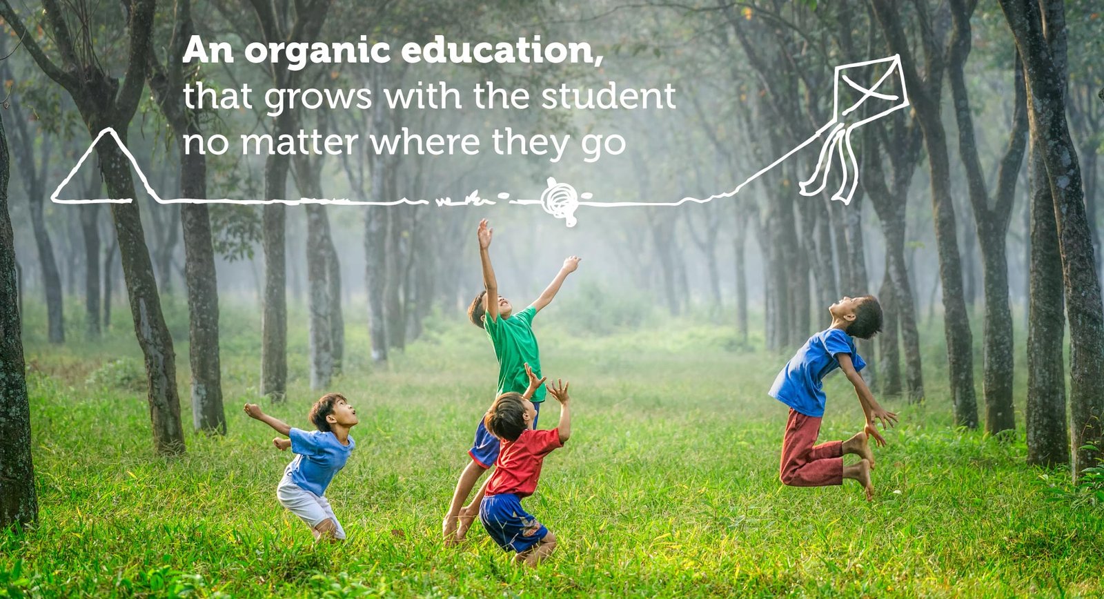
The Birla schools not only emphasize on student freedom but also provide avenues to enable students to educate themselves by empowering holistic education. The Schools are integrated with natural surroundings allowing the students to be harmonious with nature despite the hustle and bustle of city life. Providing a natural environment for true and holistic growth, the organic education that is provided grows with the student no matter where they go.


Brand Concept, Brand Identity
