GODWIT
Brand Name, Positioning, Communication, Website
CLIENT
Artech Infra Engineering Pvt. Ltd., is a renowned infrastructure company based out of Raipur specializes Quality Fabrication, Equipment and Machined parts.
BRIEF
The client wanted to venture into the hospitality business with a chain of cafés across India, starting with Raipur. The idea for the café was to offer a lively, spacious hangout spot with a vast variety of fusion food, combining dishes and flavors from around the globe. Raipur was seen as a city with a booming potential in the hospitality business and a large segment of youngsters who are constantly looking for unique recreational experiences. The USP of this venture was the innovation in flavors, plating and a uniquely crafted menu. The concept, communication and spatial design had to be guided by a powerful brand story.
Godwit was created for people who love food and enjoy experiences
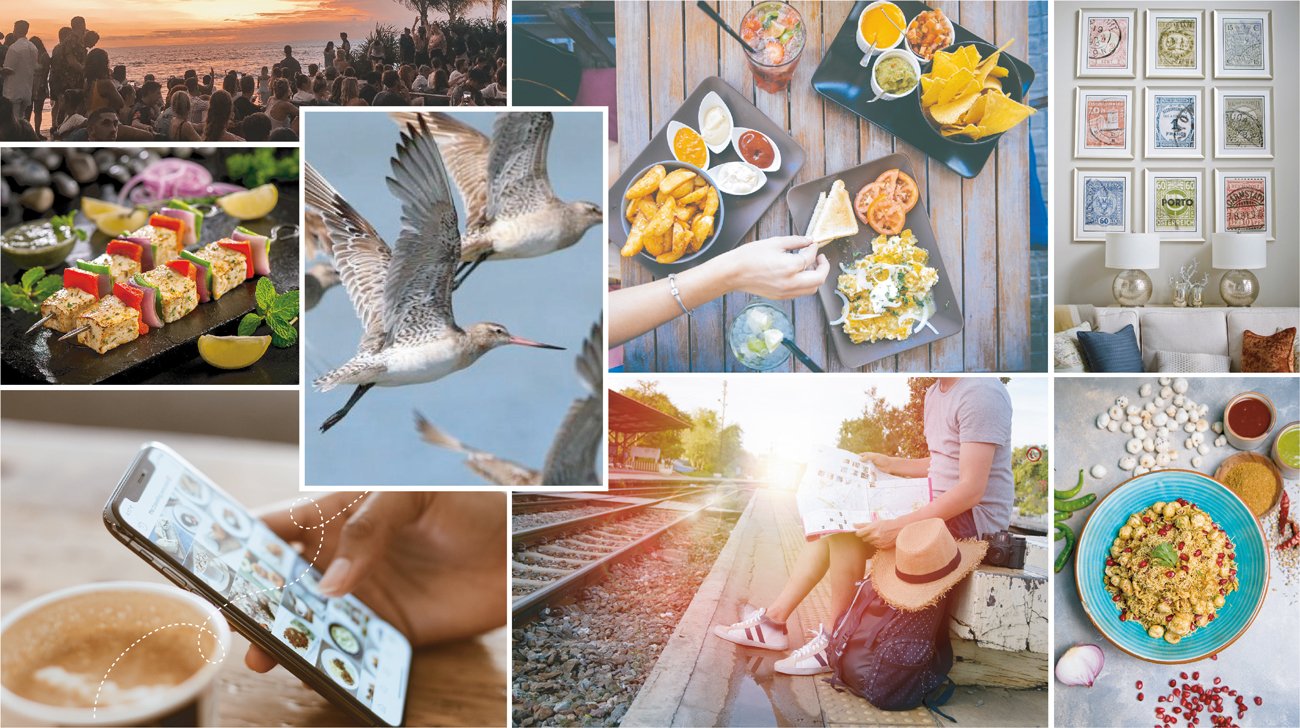
Delving into the brief, we studied the hospitality industry and tried to identify gaps and opportunities that we could use to our advantage.The Target Group was identified as 18-29 year olds. This group spends most of their money on travel, food and entertainment. They value sharing their experiences. Their traits and characteristics led to their classification as the “woke travelers”.

These woke travelers love the idea of travel and exploring new spaces. They work hard towards being exposed to new things, are appreciative of innovation and are open to experimentation. They are socially conscious and care a great deal about the brands that they are associated with. Thus, the name for this café had to be something out of the box; a name that captures some of the qualities of a ‘Woke Traveler’. We came up with the name, “Godwit”, owing to the uniqueness of the café. The name, while being open ended, ensured that it did not have any no pre-conceived notions attached with it.
Inspired by the bird, Godwit stands for strength and endurance. It symbolizes solidarity and the nature of an explorer. Godwit was created for people who love food and enjoy experiences. The palette is a mix of colours that work well for the segment individually as well as complimenting each other.

Turquoise is actually an appetite stimulant. It’s often connected to happiness and the feeling of being carefree. It’s the color of tropical waters and used a lot on dessert plates. Even if you think you are full after dinner, seeing a piece of cake on a turquoise colored plate is likely to make you want to eat the dessert anyway.

The color red raises a person’s blood pressure, heart rate, and causes hunger to be more prevalent. This is why many restaurants choose to have red table cloths on tables or red accents on the walls. Red is an excellent color to paint the main room of an establishment where food is sold

The color yellow makes most people very happy. It’s a cheery color that is noticeable in most surroundings. When people are happy, they are more likely to eat than when they are feeling sad or overly calm.

The color brown is associated with dark coffee, teas, chocolate and other desserts and shakes. This association helps build a connect with the brand’s offerings too and invokes hunger for sweets and caffeine.


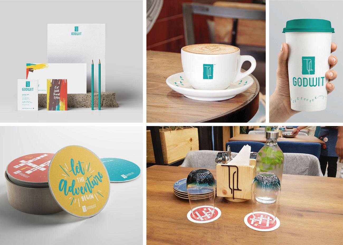
We studied the form of the Godwit bird to create a rounded but slim and slender form. It was essential to incorporate the important details of the bird while still looking minimal. The typeface for Godwit was designed to be bold, equal-height and clean. Simple, legible and catchy is what was envisioned.


The identity of the café was extended to its design style was created using minimal line work and a simple yet impactful travel landscape.
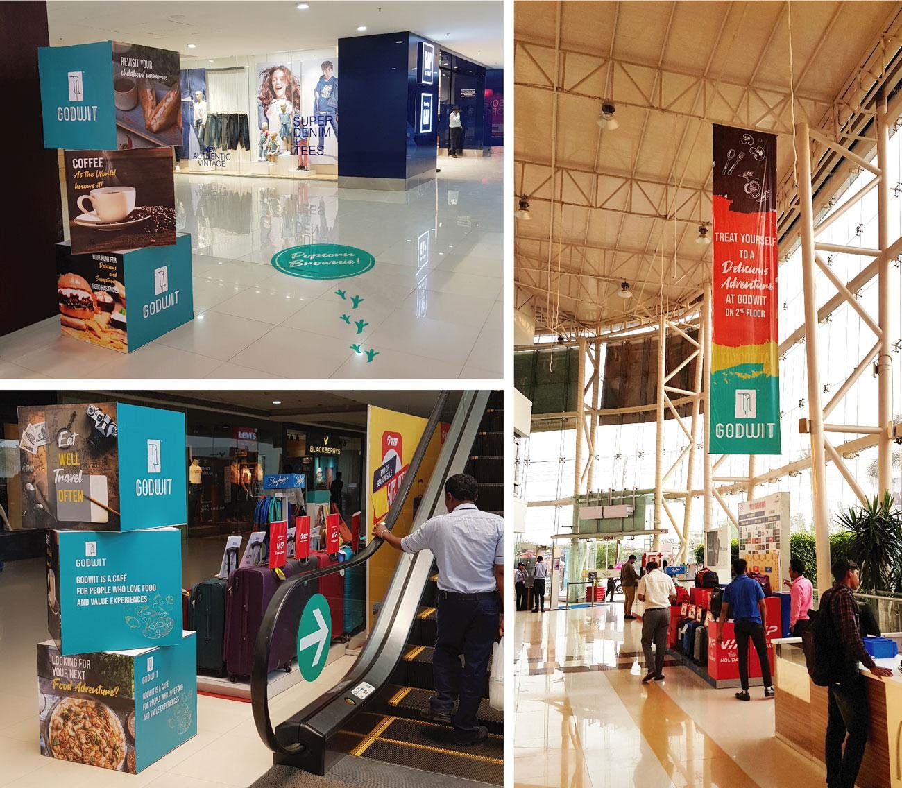
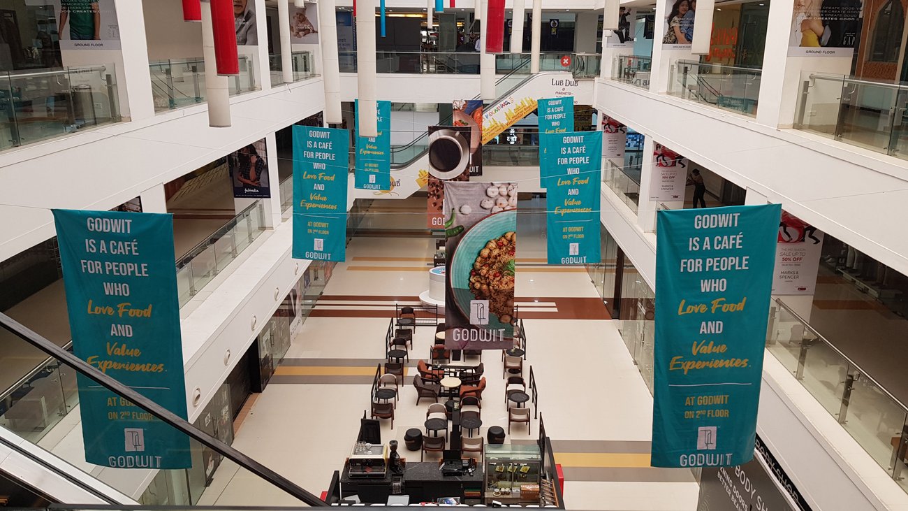
The brand was finally translated across various touch points as part of spatial branding efforts that included, Billboards, Radio advertising, In-mall branding etc. We brought out the essence of the brand throughout the restaurant that included the menu, wallpapers, coasters, takeaway packaging and uniforms.
The communication strategy for the brand online and offline was further crafted to ensure that the positioning of the brand and the messaging is communicated effectively and consistently to the target audience.

Brand Name, Positioning, Communication, Website
