Mixion
Translating an acquisition into a compelling value proposition.
Brand Positioning and Strategy, Brand Naming, Brand Identity, Communication Strategy, Digital Design
Mixion is a B2B brand developed for GMM Pfaudler on account of them acquiring the Mixing division of Sudarshan Chemicals. The purpose was to develop a brand that reflected the credibility and legacy associated with GMM Pfaudler, as well as establish a communication strategy to convey the brand architecture. The name Mixion is an amalgamation of Mix (Mixing Systems) and Ion (Atoms and Molecules) depicting the main brand offering. As a solution provider, the brand aimed for mutual growth in the market, which was articulated through a Nautilus shell and the golden ratio. Consistency and Balance at the core, the outward spiral represents growth whereas inward visually depicts the action of mixing.

The Challenge
Post acquiring the Mixing Division of Sudharshan Chemicals, GMM Pfaudler was unsure whether they needed to create a standalone brand for the same, that could resonate with their standard or bring it under the same parent company name. Additionally, the new brand had to be part of a system that associated with Pfaudler Global as well.

Solution
A Brand Audit helped us identify that GMM Pfaudler was looked upon for their leadership in Glass Lined Equipments. Building stand alone brands for individual business lines would help them project the growth of each of them, as opposed to only the Glass Lined vertical and hence we proceeded towards Branding their newest acquisition.
To differentiate from competition focusing on efficiency, technology and product ranges, the new brand was positioned to go beyond “Mixing Systems” and take on a solution oriented approach. The name Mixion is an amalgamation of Mix (Mixing Systems) and Ion (Atoms and Molecules) depicting the main brand offering. The brand aimed for mutual growth in the market, which was articulated through a Nautilus shell and the golden ratio.
_______ , a GMM Pfaudler company is a mixing technology provider with a solution oriented approach to increase productivity and profitability for market leaders and innovators

Mix
During the brand naming process, the key attributes that the brand stood for were established. This included growth, performance, innovation, mixing systems, an approachable vibe and the promise of profitability. The name MIXION was given, to clearly identify the industry and portray an established entity.

The spiral is derived from a Nautilus shell, a shell that is known to remain unchanged through all walks of life. This represents the quality that is associated with GMM Pfaudler and Mixion. Additionally, the centre of a spiral is symbolically known as the point where nature begins its consciousness, which then expands outwards into the universe. This symbolizes that through Mixion, GMM Pfaudler extends its legacy and expertise to other solution driven offerings as well.
Using this as an inspiration, the logo was developed with the golden ratio, which is known to be derived from the Nautilus. The golden ratio depicts consistency, balance, and continual growth. It is a symbol of proportional perfection. Visually the outward spiral depicts growth whereas the inward spiral visually represents the action of mixing. Its overall appeal shows expanse and is a symbol of strength.


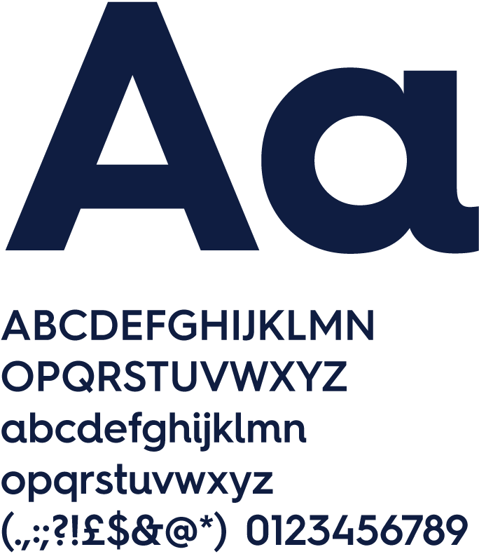

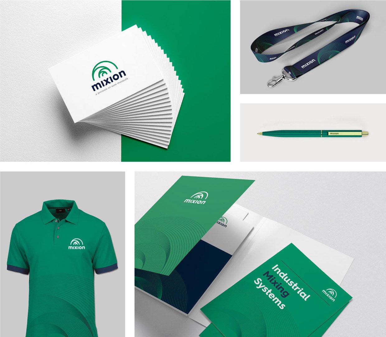
The brand was further extended into its applications, to convert the brand's promise into its visual touchpoints.
