SILA
Positioning, Brand Identity
SILA had started its facility management business in 2010. The housekeeping, security etc. of big projects in CST or Lodha is managed by SILA. Since inception, SILA had focused on the importance of training and technology, investing in proprietary facility management technology to monitor and improve the quality of their services delivery. ABND was approached with developing the brand philosophy and statement of SILA in the years of its inception. Furthering on the visual identity, imagery and brand philosophy that we built for the brand, SILA has rapidly grown to servicing clients in over 50 cities with 4,000+ employees.
Building a brand on the principles of Buddhist philosophy.
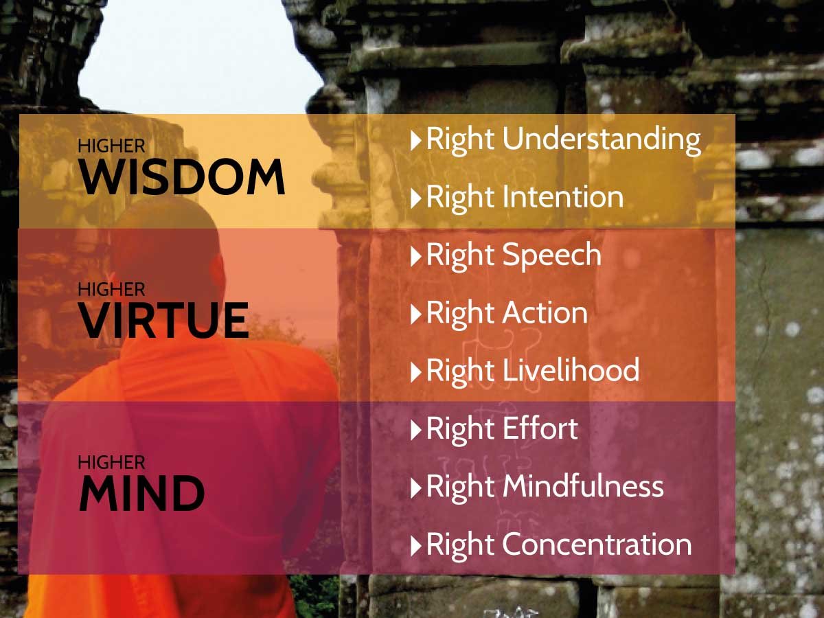
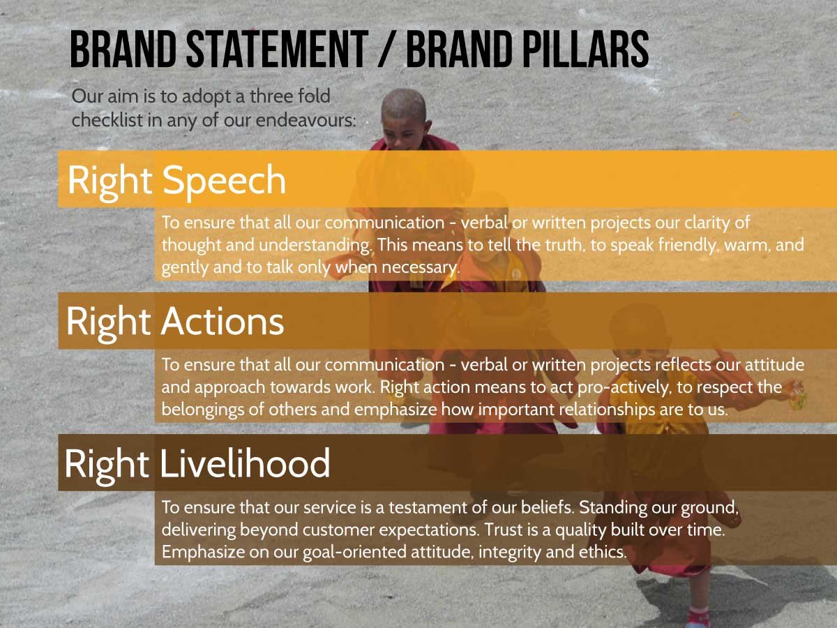
SILA, in Sanskrit and Pali, means moral purity of thought, word and deed. In Buddhism it is defined by the three of the eight pillars of the Eight-fold path; Right Speech, Right Action, Right Livelihood. The powerful meaning of the word acts as a guiding force, paving the way for the right conduct of the SILA family. Connecting its already existing name with the service offering of the brand, we built SILA’s brand philosophy on the pillars of the Eight-fold Path. The imagery was also inspired from Buddhism, considering the name. Employee branding had its basis in not only deciding on the uniform but also on considering what the right conduct of the team members should have. That is what where we tried to make a difference by making them practice the philosophy behind their name.

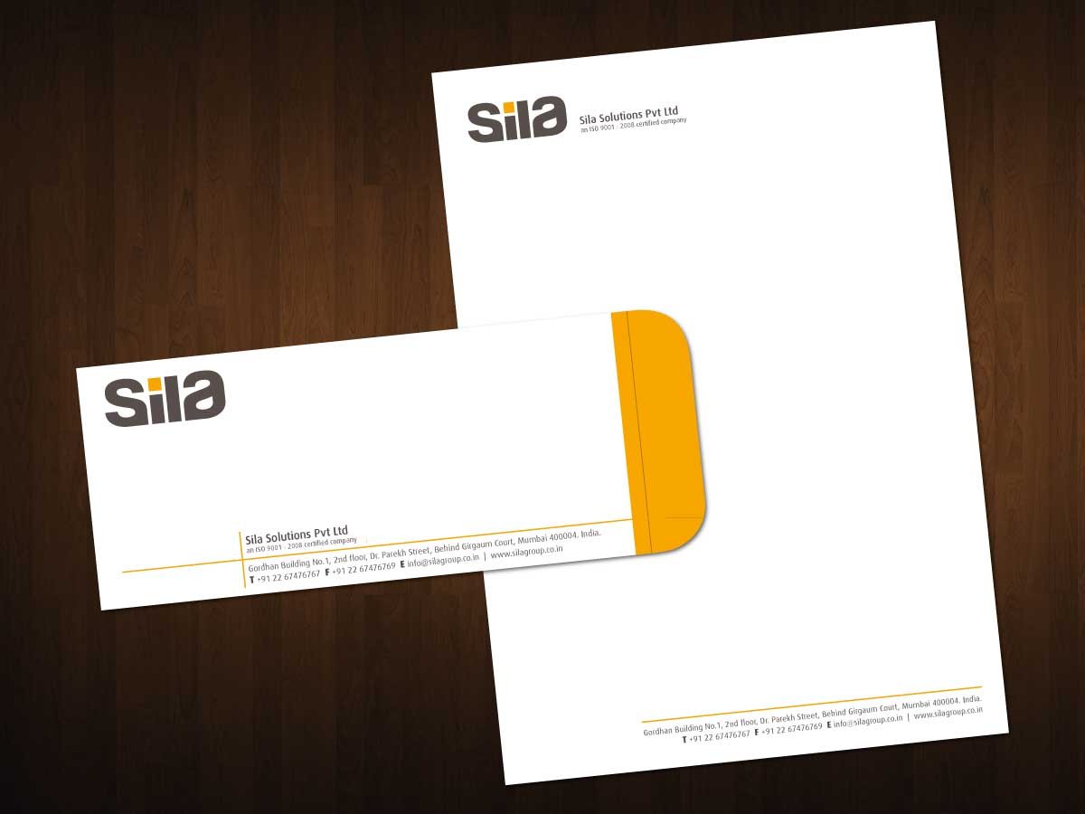
Whilst the SILA logo expressed symmetry and balance, all the company’s visual and verbal communication draws similar inspiration from varied ideologies based on the selfsame derivation of SILA that we built on. In the logo we adapted the A into a mirror reflection of S, implementing structure and balance, an important element of right conduct. The logo was crafted, keeping in mind effective application in the employee’s uniform and other applications.


Positioning, Brand Identity


