Fablespoon
Brand Concept, Brand Name, Brand Identity, Packaging
ABND was tasked with building the brand identity for this startup, having a mission to inspire the Bake-It-Yourself trend. Since the experience of baking was central to the imagery, the brand had to be positioned as one which promised a sweet fable. It was not just the end product but the experience of making it yourself that made it special.
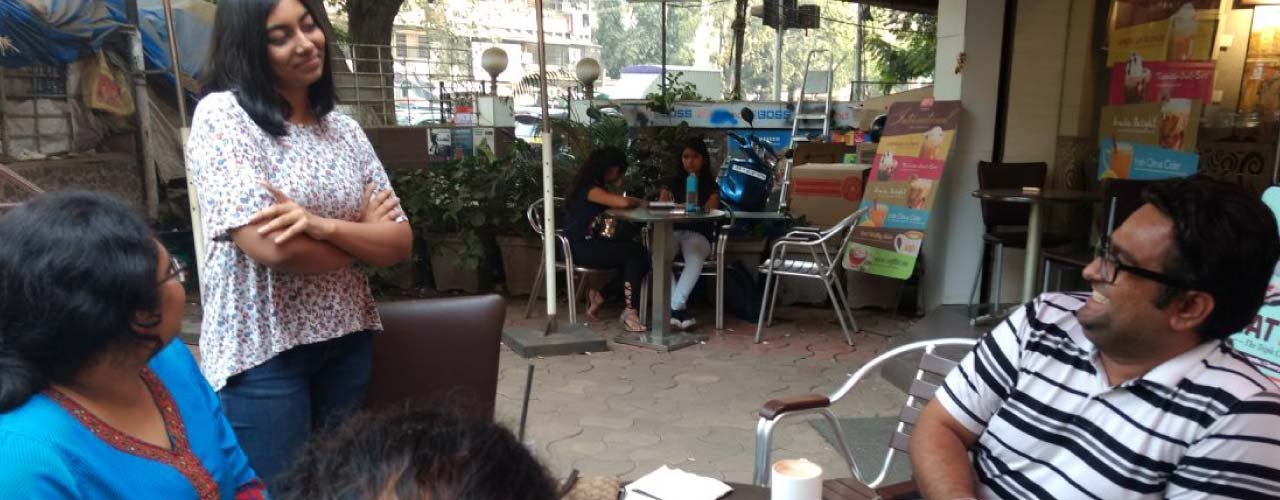
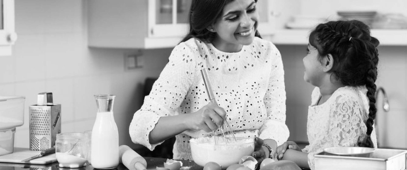
Undertaking in-depth research, we realized that the potential target market that had to be tapped is the mother and her young one, aged four to twelve. The experience of baking is the most intimate for the mother who wants to make sure that her child eats fresh and stays healthy. A baking experience at home might be a trial in the usual case. For the mother baking warm goodies for her little one this becomes an everyday ritual, making this target group the most relevant for us.
A pretty DIY baking product that's magical
The mother and the child, coming together to enjoy the experience of baking at home, gives way to the narration of a magical fairytale, a fable. Hence, a brand story of a genie and a child was built into the brand. The child wishes for unlimited sweets and baked goodies. What does the genie grant her? A Fablespoon. We went ahead with Fablespoon as the brand name, giving the brand a feel of a magical storyteller.
For the visual identity to represent the brand name Fablespoon aptly, the symbol of the logo needed to merge a baking element with a magical figure. The genie and the spoon were chosen.
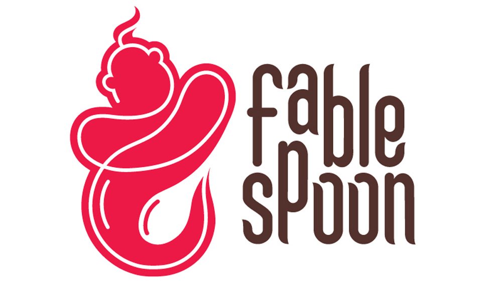
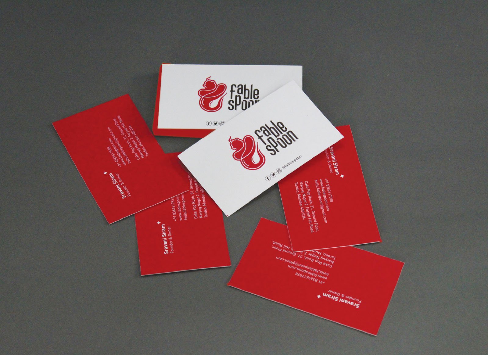
The genie is the principal symbol made prominent in the positive space of the logo. The spoon had to be brought out in the negative space, the space that is enclosed by the logo in the background. So it was decided to keep the imagery of the genie minimal, defined through continuous line-work. The spoon was enclosed by the genie’s tail. So that the minimalist logo is not lost in print, it was necessary to have a solid colour in the background of the logo. Instead of using the stereotypical blue for the genie, we decided to go with warm shades of red, brown and yellow that were closer to colours one could associate with cakes and cookies.
The logotype, being big, was introduced in a stacked version for the convenience of space. We developed our own font for the logotype, imaginatively playing around with the curves of the letters, making them rounded and less sharp to give a fun tone of magic and fables. The rounded ends were made to look like the genie’s tail.

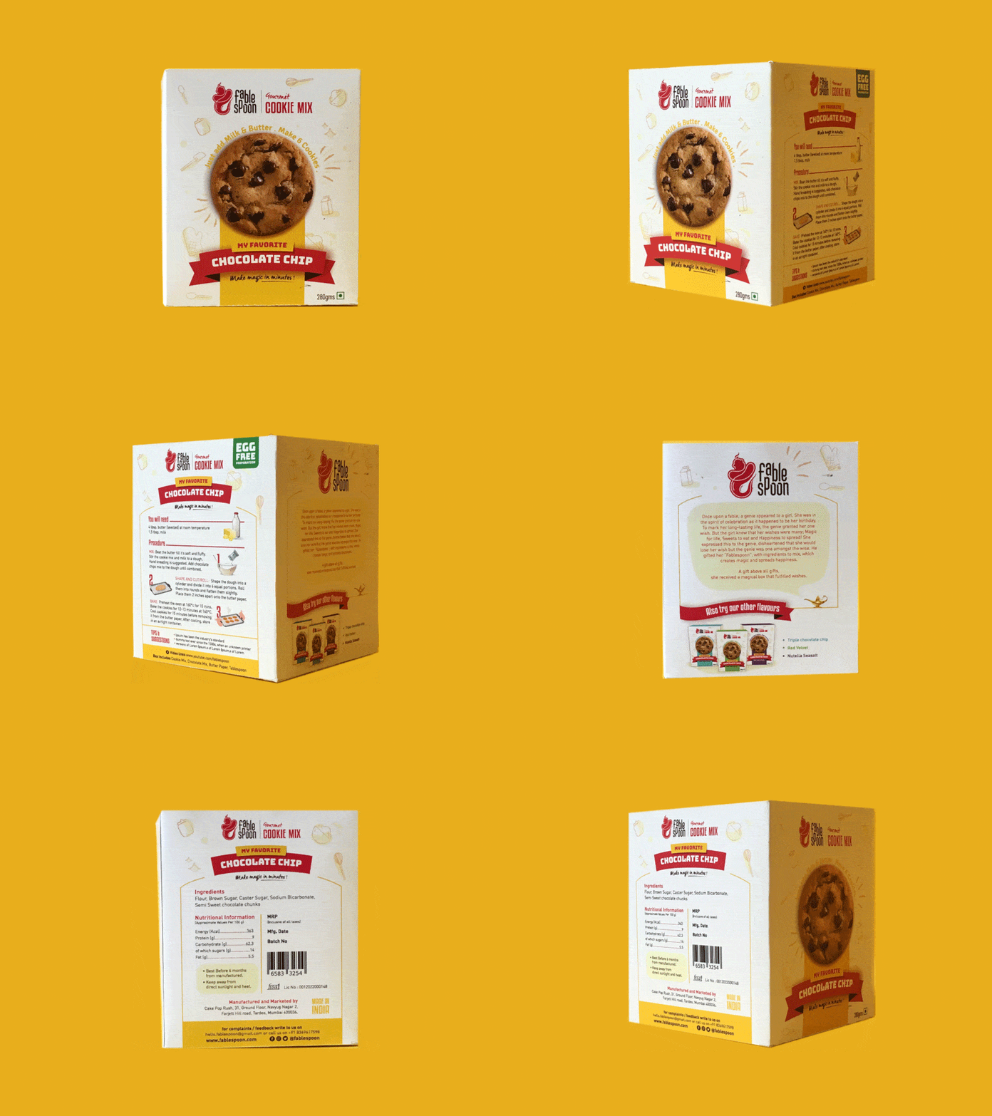
The packaging of Fablespoon was a crucial part of developing its identity. It has to stand out from all the other product packs sitting on the aisle of a shop, especially when it’s to do with food. If it appeals to your senses and you want to eat what’s inside immediately after seeing the external packaging, then only will you buy it.
After conducting a retail survey of good brands in this domain of dessert mixes, we went with a white based box to stand out from the rest. At the front of the box, the cookie stands in the center with tiny icons of baking elements, sparkles and stars in the background to portray a fun, playful and magical tone. The procedure of baking is specified in a step by step infographic on the right-hand side of the pack.
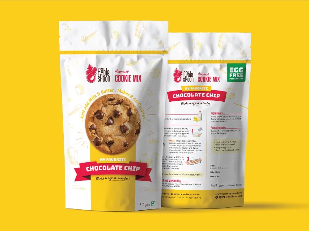
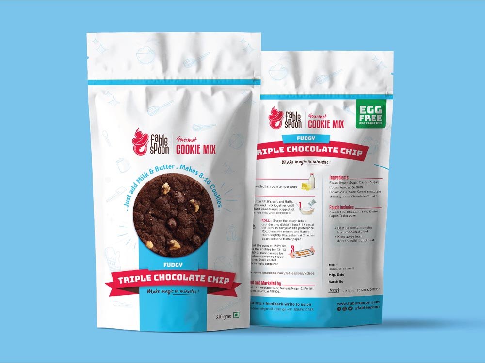
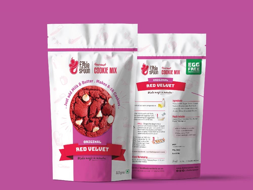
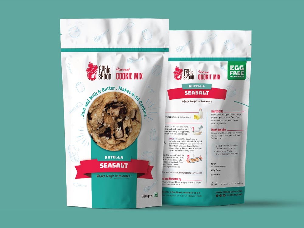
To ease an emotional connect with our target audience, the baking lovers, the back side carries the fable of Fablespoon, the story of the genie who granted a fablespoon to a child on her birthday and fulfilled all her dreams. If the baking enthusiast happens to turn over the box, she is met with a happy, mood lifting quote- “Bake the world a better place.”
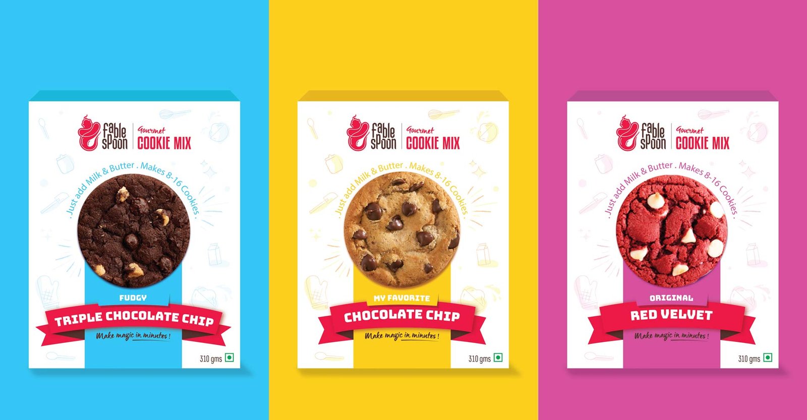
Brand Concept, Brand Name, Brand Identity, Packaging


