FLAME UNIVERSITY
Rebranding, Positioning, Brand Name, Brand Identity, Communication
The foundation of FLAME University is built upon the keystone of revolutionizing the Indian education sector. A pioneer of Liberal Education in India, FLAME University is one of the most reputed and respected universities in the country with a focus on learning with a purpose of self-discovery. To help achieve this they’re equipped with faculty and student exchange programs from the best institutions worldwide, in addition to affiliations with top universities of the world like Harvard University, Wharton School, Stanford University and more.
The first step in moving forward was gaining an insight into what the stakeholder perspective about the brand was. In order to do this, we carried out extensive, in-depth qualitative research with 4 key stakeholders – the faculty, parents, students (FLAME and non-FLAME) and alumni, through a process that involved interviewing over 300 people. The insights we gathered here regarding the university and its competition became the basis for a fresh brand concept and brand communication strategy.
The Story of How A University Donned A Rejuvenated Identity.


FLAME began its journey years ago as a forerunner of Liberal Education in India. However, by the time they decided to rebrand themselves as FLAME University, several competing institutions offered Liberal Education as part of their curriculum as well. In an attempt to set themselves apart from the clutter, they looked to rebrand themselves by giving Liberal Education a new way of expression – ‘Diversity of the Mind.’
The central theme and vision for the ‘new’ brand of FLAME University was ‘Diversity of the Mind.’ This fresh brand thought revolved around the seamless blend of diverse disciplines upon one unified platform, thereby creating a culture of complete learning that is not one dimensional. This brand concept was then translated to a brand identity and later extended to other applications as well. ‘Diversity of Thought’ now became the principle all members of the FLAME family were encouraged to imbibe.

The symbol of FLAME University in their brand logo, the crest, incorporates the brand’s multidimensional learning culture. Fashioned around a dynamic ‘F’, the new crest draws inspiration from the core concept of liberal education at FLAME – as being inter-disciplinary and diverse.
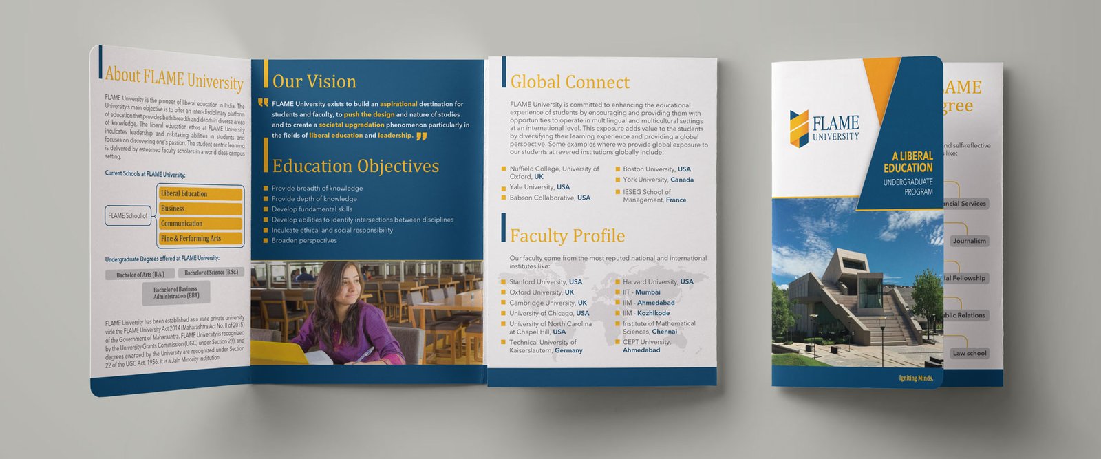
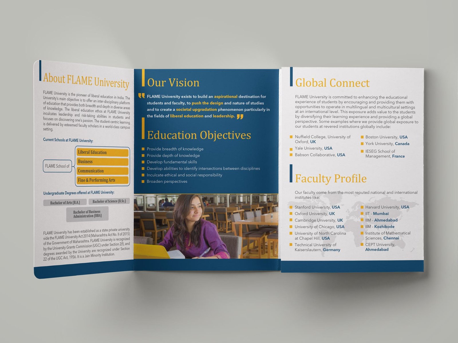
The visual language echoes the passion and devotion FLAME has towards the journey of constant learning that is rich in diversity, unique in approach, and spirited in its dynamism. This visual style has also been extended to multiple brand applications in merchandise and spatial design.


Rebranding, Positioning, Brand Name, Brand Identity, Communication
