Precision Electricals
Fostering new standards of quality and ergonomics in the Electrical Industry.
Positioning, Brand Identity, Communication Strategy, Website
Precision Electricals is a B2B service provider in the electrical industry. Supplying to major projects like Lodha, Ruparel, Godrej, Hiranandani and similar names. Being in the electrical industry for the past 33 years, they not only aim to be a ‘one stop solution provider’ but also believe in ‘no compromise over quality’. With a vision to offer the best in class products and services, Precision works towards providing an overall smoother experience and way of living by building their brand and catering to the end user in the B2C space.

The Challenge
Precision was established in 1988 and their Brand Identity remained constant through the years. Placing them in the B2C market, this looked extremely old school and lacked the perception of credibility and legacy that the brand was built upon. Additionally, there was no Brand and Product Architecture established, resulting in numerous individual brands that did not add any value to the parent company or build brand equity.
The Solution
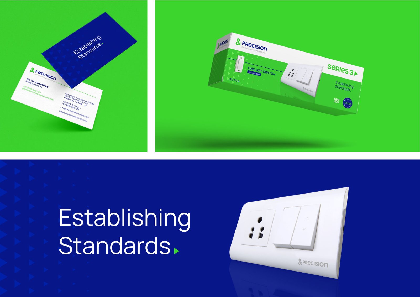
Transitioning from a B2B to a B2C market, Precision Electricals was positioned as a brand that goes above and beyond industry standards and sets a new benchmark. With emphasis on end to end control of the supply chain and product ergonomics, the brand offering was crafted to stand true to its name and offer “Precision across the line”. The target audience identified as the Ambitious Pragmatic Buyer does not just seek a way of life, but rather a conscious experience of living, with their family and in society. This was translated to the Brand Identity which contains the Precision P, an infinity symbol to resonate with the timelessness of ergonomically designed products, an upward arrow for the growth of the company and an ampersand to symbolise the vision of exceeding expectations.



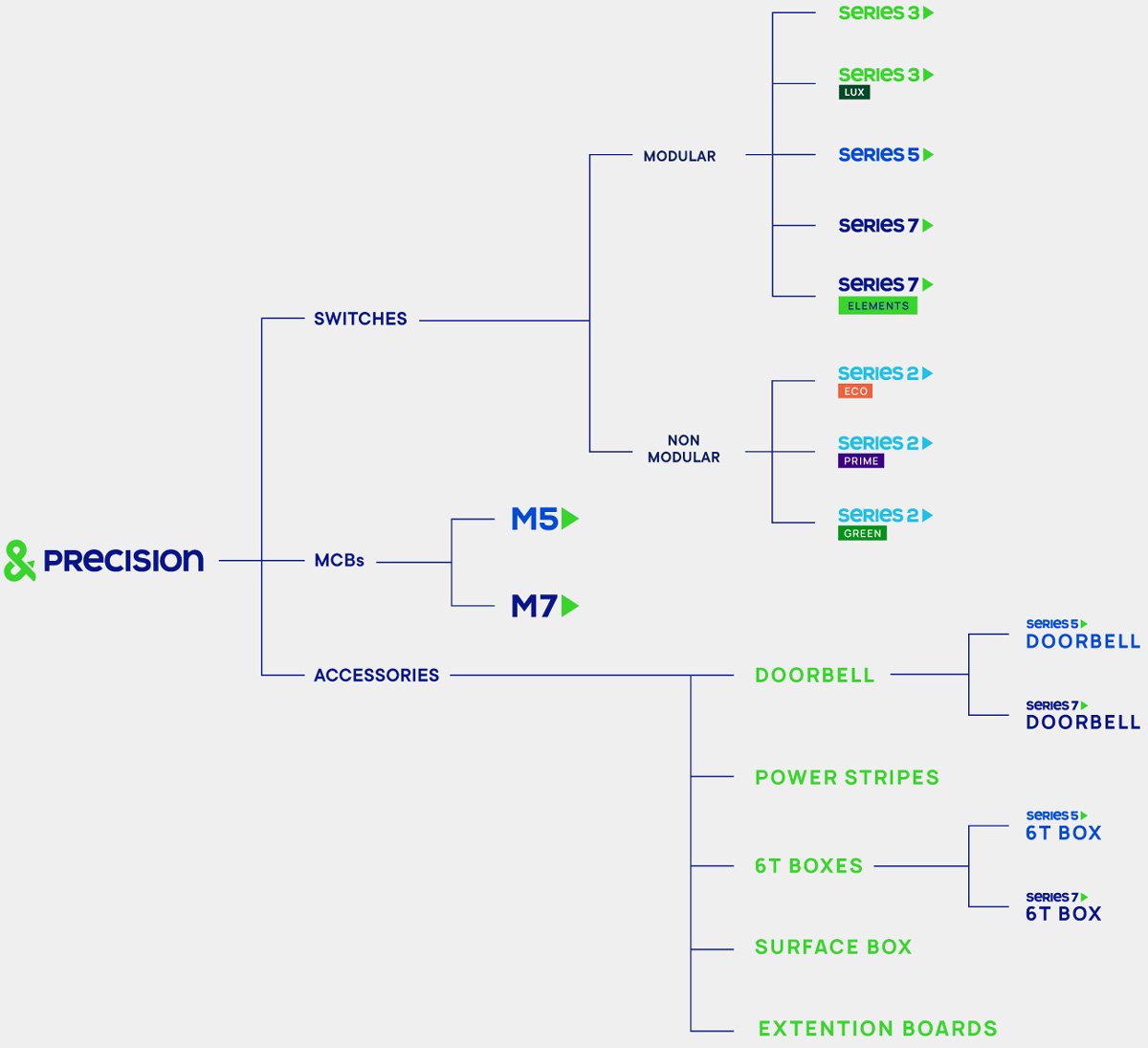
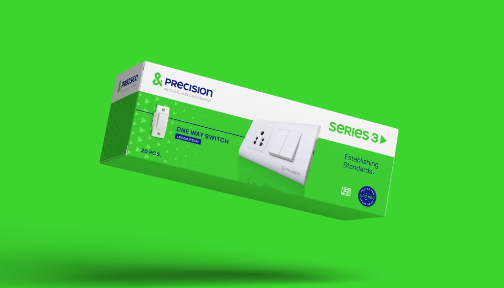
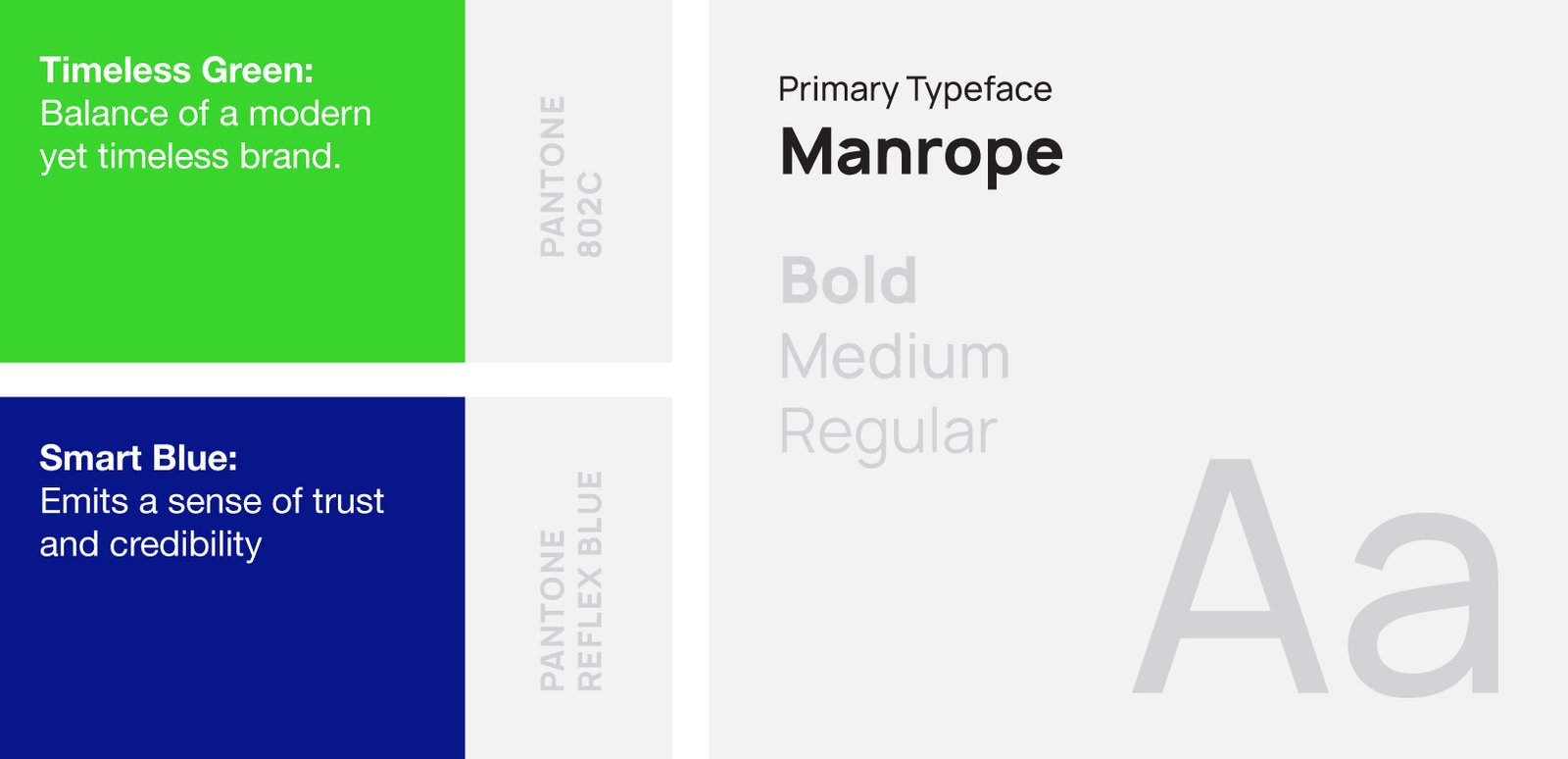
To make the Brand further resonate with being established, credible and organised, a Product Architecture Strategy was devised to ensure that each brand under the umbrella builds Brand Recall and Equity for the Parent Brand. The colour palette was articulated basis the different price ranges of the products, which makes it easier to identify on a retail shelf. The system allows them to strategically categorise all future offerings, irrespective of the product range.


