Pressfit Pipe and Profile
An end-to-end electrical solutions provider, offering multiple solutions under one roof.
Positioning, Brand Identity, Communication Strategy, Website
Pressfit is an electrical solutions provider established in 1979. Since it’s inception, Pressfit has launched more than 4000 SKUs and boasts a PAN India distribution network. They ensure that their products not only adhere to the quality standards of the market but surpass them.The constant will to improve themselves is clearly visible in their state-of-the-art manufacturing plants.
The Challenge
After 4 decades of expertise, they aimed to rebrand themselves, to cater to both B2B and B2C audiences, with an overarching organizational reason to believe.
In a crowded category with numerous brands and their respective offerings, Pressfit had to focus on communicating a single aspect, as opposed to investing on individual communication and promotions across their basket of offerings.

The Solution
Pressfit was rebranded with the idea that thoughtful homes are driven by simplicity and efficiency. We identified that the target audience sought convenience owing to the overpopulated space, something which is otherwise an innate need, and overlook by the category.
Pressfit was positioned as an end-to-end electrical solutions provider, offering multiple solutions under one roof, to sell the idea of convenience. We further defined the brand under three key points which was backed by its legacy, expertise, and credibility; they are; concentration of distribution, the pride of a national brand across international boundaries, and the desire to make electrical solutions simple.
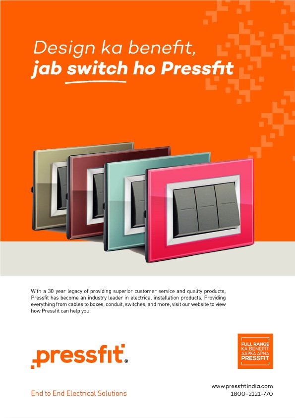
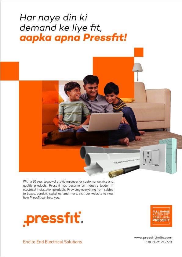
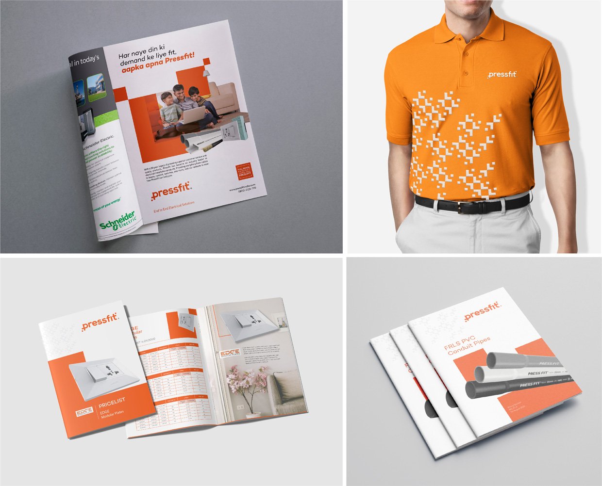
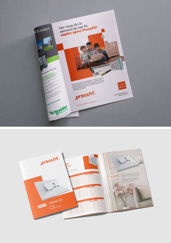
Owing to the price point of the product and the identified target audience, we established a Hinglish (Hindi+English) style of communication. The trust and credibility of the brand, proven by the product quality and legacy was projected as a level of pride. This was depicted through a communication unit stating Full Range ka Benefit, Aapka Apna Pressfit to reinstate the relationships built till date, and convey the basket of offerings.
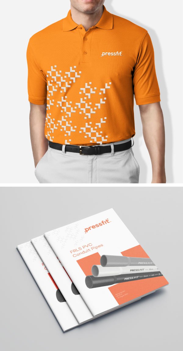
Pressfit had built significant recall across 40 years of experience and were recognized by their orange colour. We kept this constant, with a more refreshed shade to stand out across multiple touchpoints.
The rebranded identity was kept minimal, with two dots across a diagonal axis, depicting an end-to-end range. The ’p’ and ‘t’ were further modified to symbolize an arrow.


