Queensline
Positioning, Brand Name, Brand Identity, Communication, Website
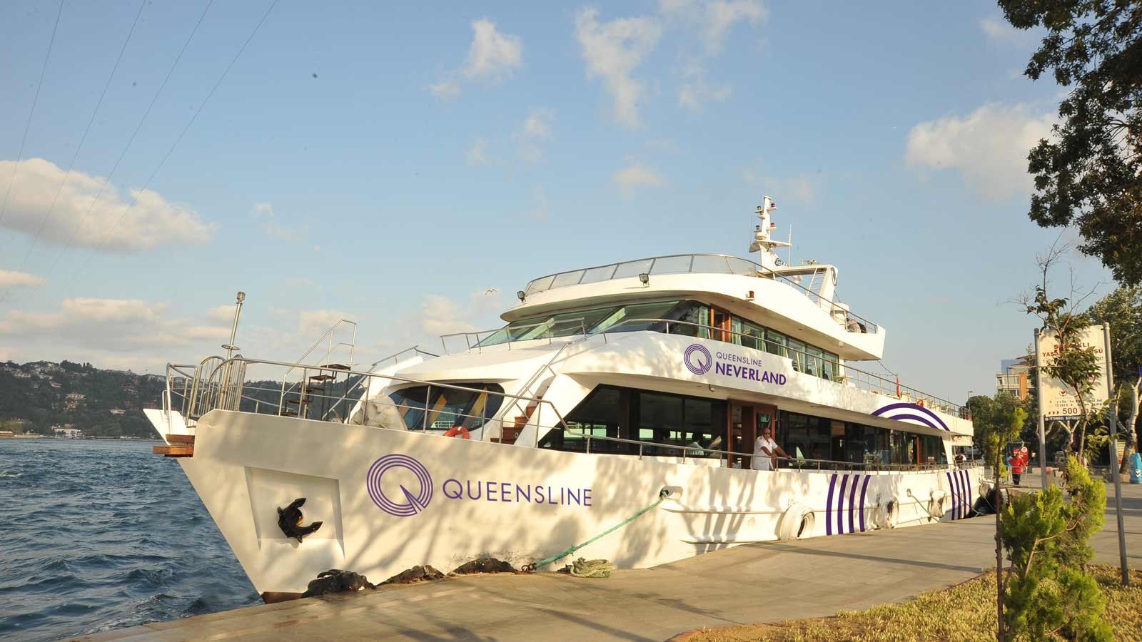
Setting sail for the first time in the South Mumbai seas in the iconic sites of Gateway of India and Girgaum Chowpatty, a chain of floating restaurants wanted to take us on a cruise in two of its spacious and luxuriant vessels, Neverland and Sea Yah.
We looked into building their brand identity from its very inception.
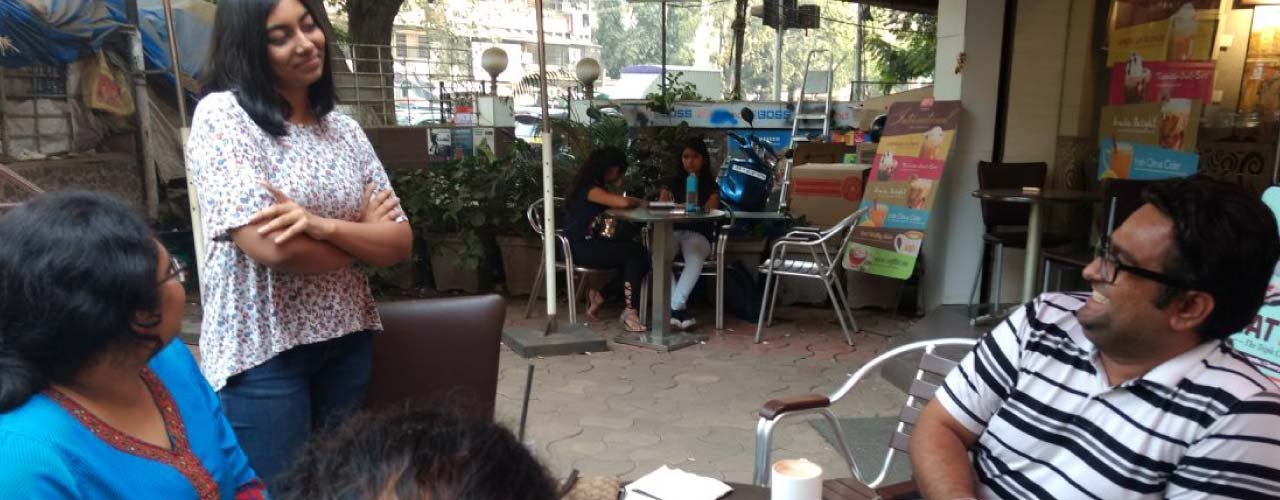
After conducting an exchange with the clients and researching about consumer behavior, we found that there were two main types of target audience of this brand- ‘the power couple’ and ‘the gang.’ The main characteristics of our target audience were that they are open to new experiences and don’t mind spending the big bucks when they want to have a good time. We were inspired by the Olive loyalist when building our consumer profile. More than the food and the dining experience the ambient experience was significant. In the needs hierarchy, our target market could be identified to be desiring for esteem. They feel that they deserve the respect they get & subconsciously expect it as well but without asking.
Branding the first line of floating restaurants in the South Mumbai seas


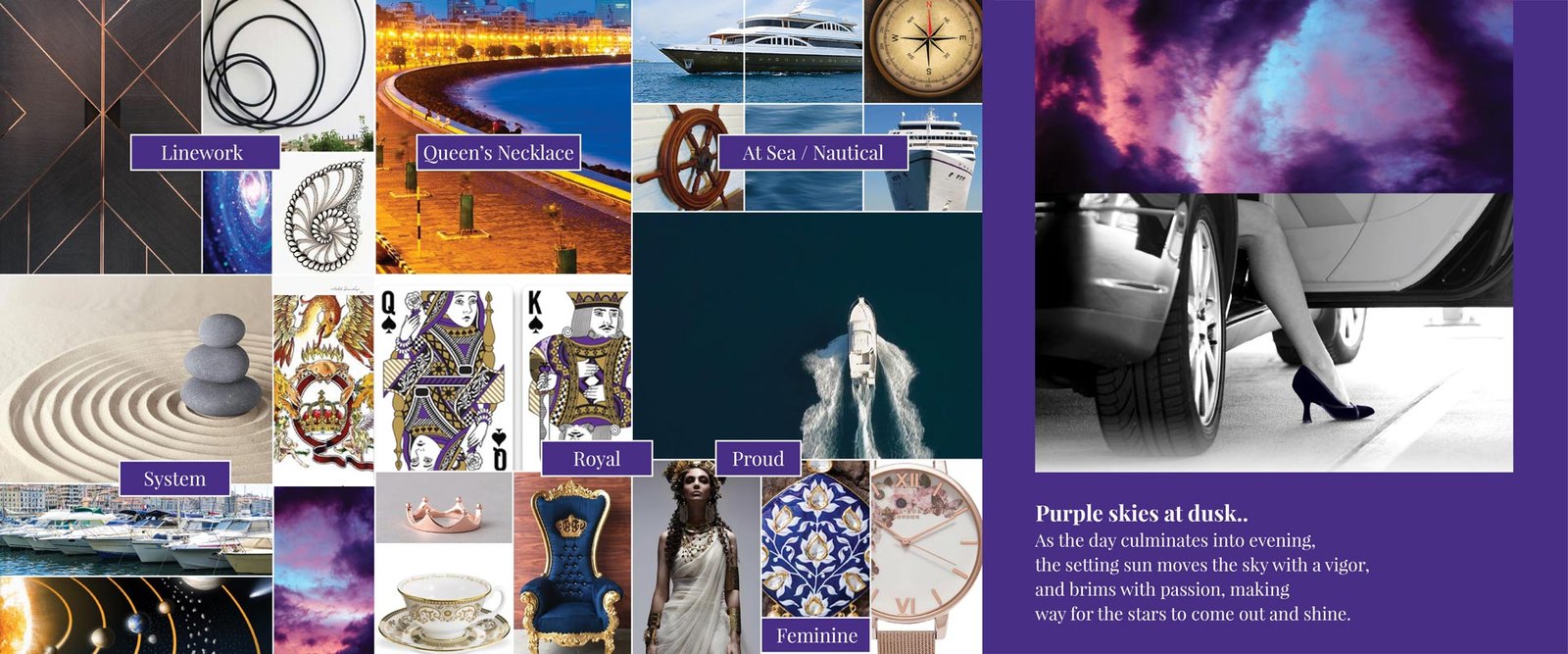
After delving into this in-depth analysis of the target consumer mindset and the market competition, we presented the brand essence as “Passion In Detail.”
Everyone says they have a passion. The more focused say they’ve passion for details. But there’s a little something beyond. Passion in Detail is about knowing before being told. Passion in Detail is also about doing when not told. It is about checking the core first, periphery next. It is about having an eye that sees all. It is about every element – the plate, the spoon, the fork and towel and glass.
Response on call and on no call – that’s the hallmark of this route. Also, the ‘Passion in Detail’ conveys respect and makes one happy and special, which is what the target audience desire.
After multiple explorations and looking at names in the category and cross-category, the name Queensline was decided.

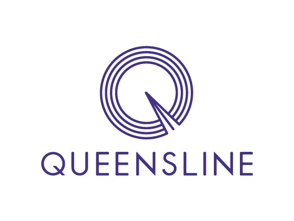

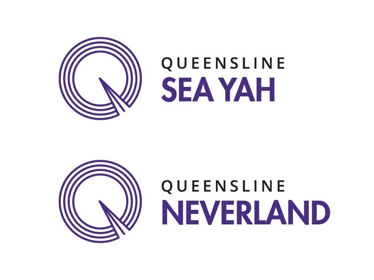
We created the visual identity for Queensline. We wanted to develop the story of a moving ship creating ripples in the ocean. In Zen, ensō ("circle") is a circle that is hand-drawn to express a moment when the mind is free to let the body create. Queensline takes the plunge and moves effortlessly into this circle of free spirit and expression that is brimming with opportunities. Moving towards the center it becomes the centre of attraction and soon starts making ripples in the seas. Nobody can deny its position. The Queen arrives, leaving behind a trail, leaving behind a mark.
To convey the story of passion in detail, the colour purple was chosen. As the day culminates into the evening, the setting sun moves the sky with a vigor and brims with passion, making way for the stars to come out and shine. Here, the purple skied evening gives way to the arriving Queen, in the center of the circle of passion and free spirit.
An ongoing process is also underway; of developing the website and working on possible merchandise and giveaways to our clients on board and making them feel the passion in detail that we stand for.


Positioning, Brand Name, Brand Identity, Communication, Website


