ALLORA CITY
Brand Name, Brand Concept, Brand Identity, Communication
CLIENT
Om Landmarc Group is a Mumbai based establish builder with numerous development and redevelopment projects in different parts of the city.
BRIEF
Om Landmarc approached ABND for a new project, planned in the Deopada area close to Neral. This planned project was not only a basic residential project, but rather a township or a lifestyle in itself. The project was aimed to target the lower middle-class families, or first-time home buyers who wanted to be associated with something big, and not be defined by their income group.

An aspiration and a dream, creating a brand for the larger than life experience.
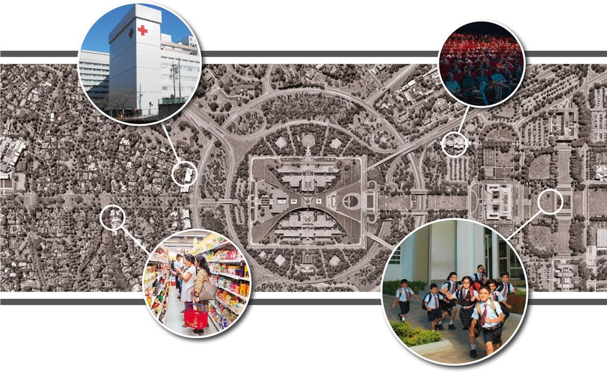
Apart from the basic amenities of a residential complex, this project also promised bus services to and fro Neral Station, schools and/or hospitals, children play area, walking tracks, an amphitheatre, a club house, an indoor play area, community hall, solar-powered lighting, rain water harvesting and over 50 shops inside the complex. This made it not just a complex, but a township in itself, thereby leading to the concept route of a township or a mini-city.


After studying the target audience and their personalities, the naming process surrounded the concept of clubbing aspiration with the township. It is rightly said that “To aspire is to dream, and to dream is to reach for the stars.” The name Allora City was derived from Allora, which means the “Shining light”, whereas the city is a self-explanatory township, which is complete in itself. Allora symbolizes hope through the light, a metaphor for the dreams of our target audience. Allora is also the existing name of a star, which perfectly summed up the entire concept.
Allora City is therefore a place where dreams come true.


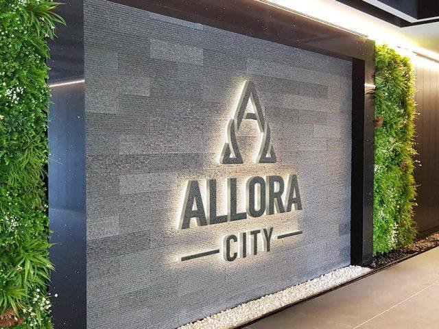
The A symbolizes Allora, along with its peak depicting an arrow, giving a sense of direction to its residents.

A horse shoe is considered as a symbol of good luck and prosperity. When hung with the open end down, it depicts showering good luck on anyone who walks below it.

The A and the horse shoe clubbed together gives the audience a place or a home filled with good luck, for all their dreams to come true. The arrow is also a symbol of courage for the residents of Allora City to take new steps and grow in their lives.

The brand identity was extended to its communication through image styling and a unique visual style. Each image was stylized to depict the peaks of growth. The images chosen were different from regular building amenities, but rather played on emotions that stemmed from Allora City. The knots that connected the horse shoe and the A in the identity were used in the communication to symbolize the unity and togetherness of a township.

Unique icons were created for different amenities within Allora City by extending the visual style further.

Brand Name, Brand Concept, Brand Identity, Communication
