ALOK PROTECHNIK
Positioning, Brand Name, Brand Identity
Alok Industries is India’s largest fully integrated textile company, with a huge turnover of several crores. Alok has exported to big fashion labels over 80 countries and has won numerous awards and accolades. In India, Alok Industries is also the forerunner of protective wear manufacturing, offering a large collection of protective fabric/garment solutions to militaries and various industries. There was no brand architecture in place to segregate both these identities, of a fashion wear supplier and a protective garment brand. At a B2B level, they needed to have a distinct identifier. People couldn’t envision a high-end fashion label and a military uniform in the same space.
From fashion to military wear- Making disparate domains distinct
Alok Industries had the expertise, experience and top quality merchandise. What it needed was an identifiable product line for its protective wear, a well-defined product architecture. The challenge here was that the material composition of the protective wear fluctuated depending on the country it was being exported to. In essence, it could be standardized only with the scope of customizations being made available within branded categories. But product customization was so high that the brand was losing out on impacting people with a strongly integrated, cohesive identity. Internally the sales team would be selling under the ‘Alok’ label and people had a hundred permutations and combinations to go through themselves before buying. People had no sense of familiarity with their product because of the lack of definitiveness. This hindered the company’s plans to expand the product into new markets.

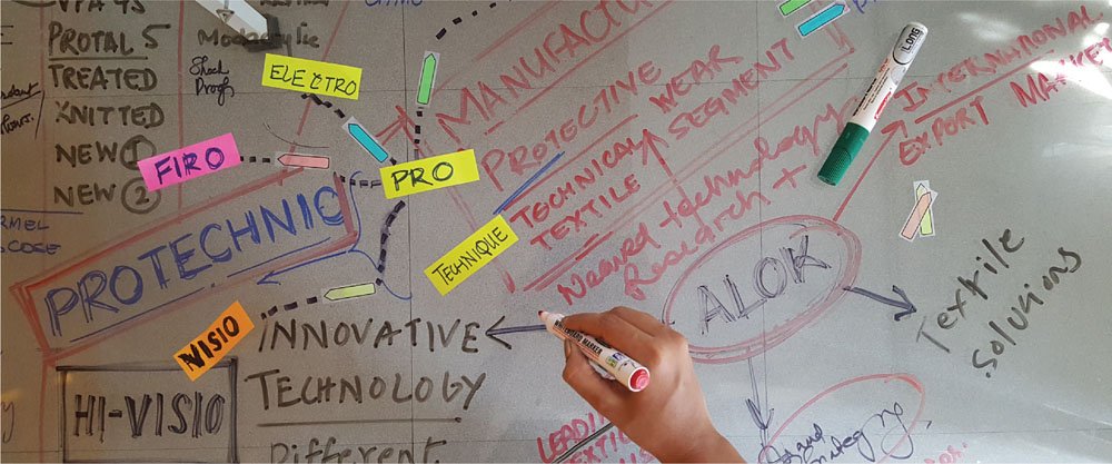
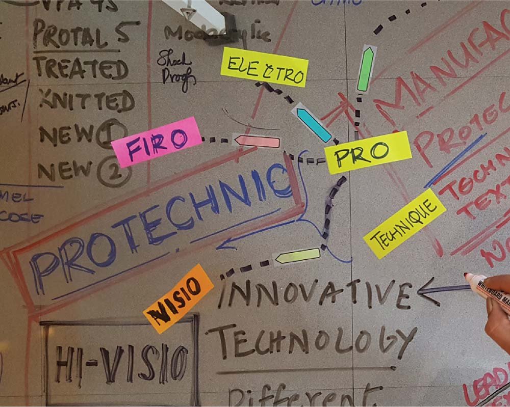
The key objective was clear – to brand one of the largest protective wear garment lines and create a strong product architecture to streamline the business and the brand. To get this going, we conducted an extensive brand workshop with the internal teams at Alok, particularly with the sales wing and the RND team, to understand the material the applications of the varied fabrics used as well as the highest selling material for the brand. The purpose of the workshop was for us to gain clarity with regards to business goals, communication objectives, key product USPs so that we can establish the brand concept and position the product line.

Based on the workshop and the brainstorming sessions we crafted the brand positioning to match their business strategy. This concept and positioning then led to creating a product name, identity design, tone of voice and most essentially, the product architecture.
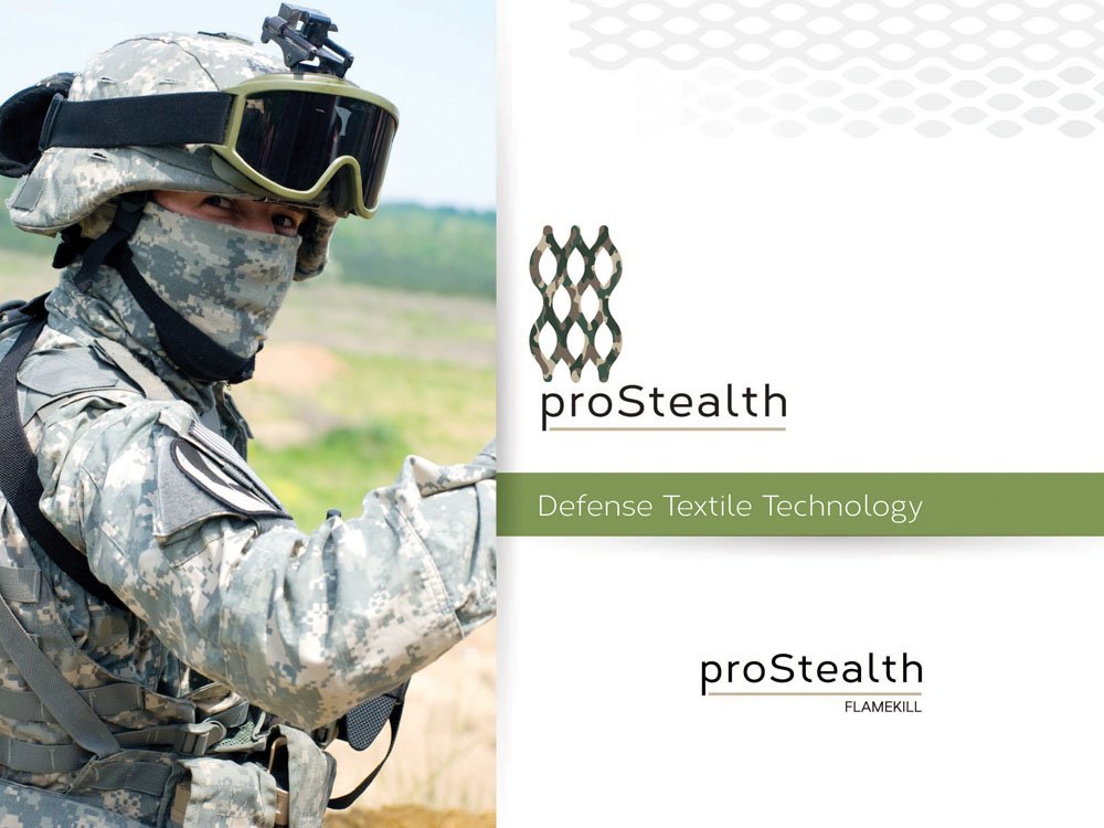
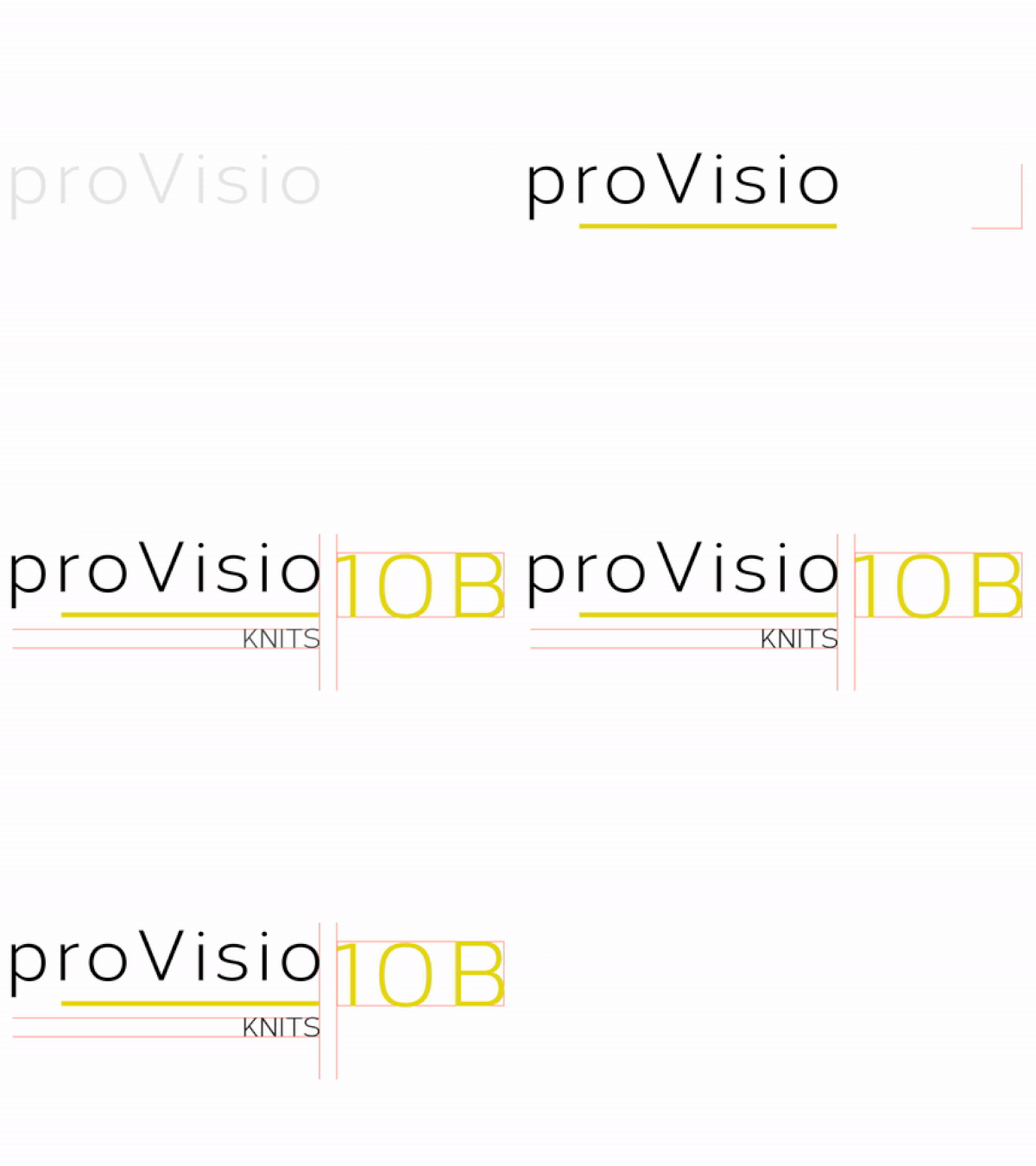
The product architecture was formed based on the product type, industry application, material composition, textile usage and market demand. It was crafted to be flexible enough to extend itself to additional lines in the future as well. Moreover, the new line was branded to be easily understandable, standardized and also customizable if so needed. A sales kit was created for this protective garment label. We created the identity of the “Protechnik” for them, which included three key ranges – Pro Firo (Flame Retardant), Pro Electro ( Electric Arc Resistant) and Pro-Stealth( High Visibility and Defence Textile). When working on the sub categories under each range, we retained certain coded numbers that were colloquially used, to put the sales team at ease while explaining the material composition of the categories. Hence the sub-categories would read Pro Firo 45 and Pro Firo 90 depending on the material composition and not a hierarchized list of names like Pro Firo Gold or Pro Firo Silver. The categories shouldn’t give an idea of superiority or inferiority, which terms like gold and silver would be related to.




Positioning, Brand Name, Brand Identity
