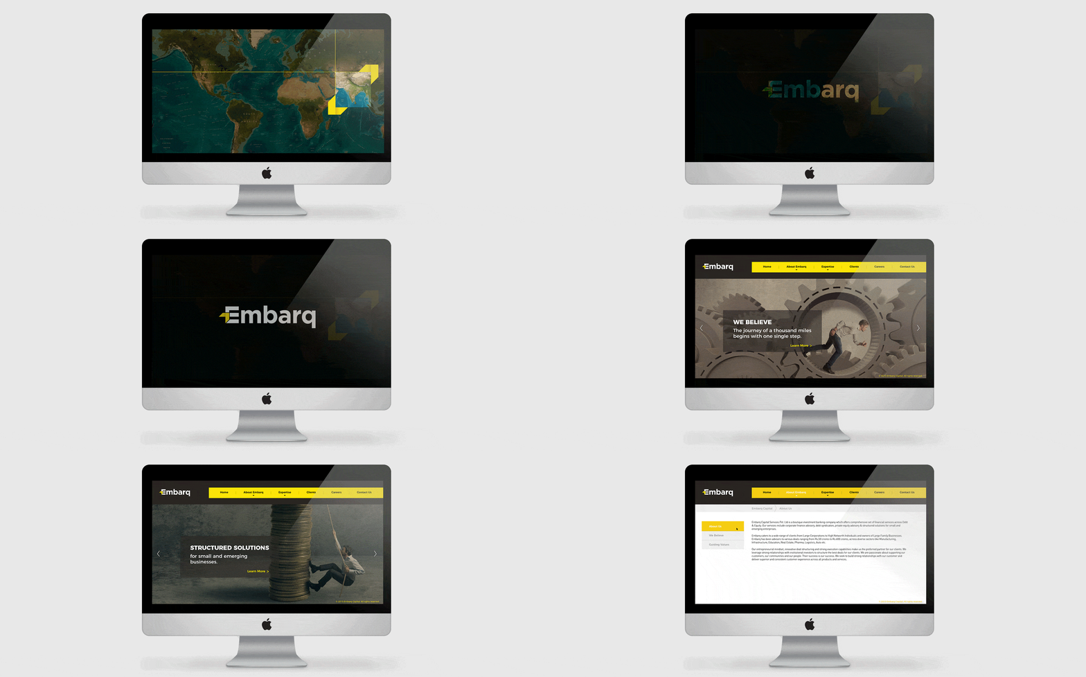
A financial start-up company came ahead, specializing in debt and equity services. This company was involved in providing world class services of Loan Against Property.
After understanding the structure and ethics of the company, we zeroed down on the singular objective of establishing the brand identity as one of ‘financial prosperity as a journey and not a destination.’
Building faith in a brand’s ability to bring forth financial stability
Every day we embark on a new journey. A journey to seek new frontiers, a journey to achieve, to accomplish and succeed. Thus the brand name, ‘Embarq’ was given; a name that grounded the identity of the brand as a faithful companion that sees you through difficult times leading up to your financial stability.

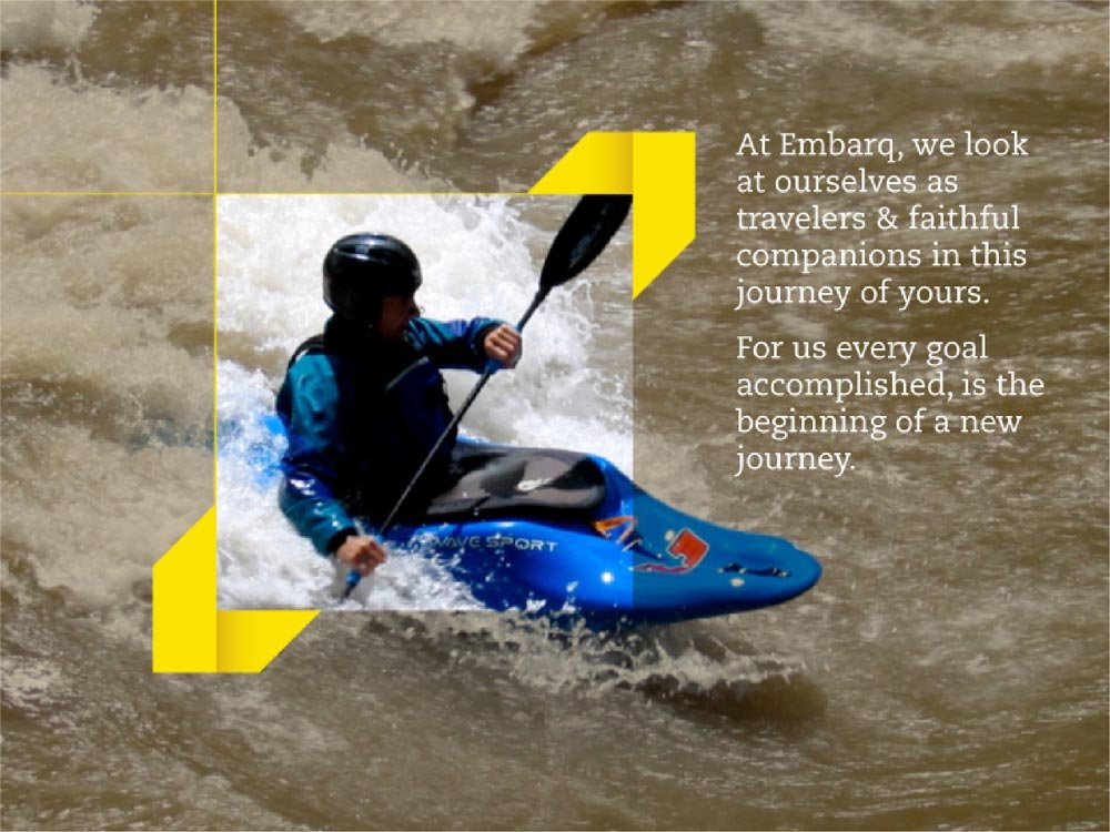
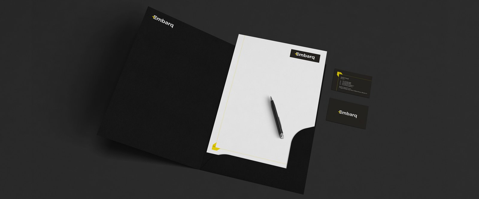
The entire brand image was created to have a stalwart identity in order to inspire confidence, with long, thick arrows projecting an onward movement and agility in the clientele’s financial journey. While the form of the logo showcased a sense of immediacy with the use of an arrow in the ‘E’ standing out in the colour yellow from the otherwise whiteness, it was also created to symbolise strength and stand the test of time.
Brand Concept, Brand Name, brand Identity
