Lazzaro
Positioning, Brand Name, Brand Identity, Packaging
A startup was gearing up to launch itself as a mass market tableware brand that had a wide range of offerings in premium range and daily ware crockery. Tableware was not a market which fostered impulsive buying. Women buying utensils for daily use wouldn’t be likely to get such necessities too often. As this company was aiming to reach out to the largest possible market for tableware with a diverse range of offerings, they were unsettled regarding how to position themselves in the market.
How beauty and utility worked perfectly for positioning a tableware brand
In this market, identities were distinct- either there were small kirana shops catering to such furnishing needs or big exclusive tableware brands. Should they position themselves as premium, functional or somewhere mid-range? To be noticed by the end consumer where should they feature- in big retail chains or small grocery outlets?
As the branding strategy for this startup needed structural clarity, focus group interviews and market surveys were necessary at its inception. The in-depth qualitative research was carried out, based on interviewing seventy-six young and middle-aged women belonging to the middle and upper middle classes from across India. This helped us in building an ideal-typical buyer profile for a mass market tableware brand.
We found out from our sample set that there were three types of tableware bought in Indian households:
- Daily ware utensils bought once in two or three years, only for utility
- Tableware bought for special occasions like festivals, anniversaries, housewarming parties etc. Typically this would be purchased once in five to ten years.
- Premium silverware or heirloom that was bought once in a lifetime and passed on from one generation to another. In the north and in parts of western India this tableware was more of a showpiece having no utilitarian purpose at all.

The third type of crockery is usually purchased in consultation with the head of the family. We found out that the buyers in this market were not brand conscious but they came clear that they loved buying imported crockery. In the interviews held with ABND, these middle-class women said they would be intimidated to enter a branded store in the shopping mall but would also feel ill at ease buying tableware from a small local shop. A retail shop would be the ideal setting to catch their attention. So would an international sounding name.
Thus Lazzaro was launched.
When shopping for tableware they would likely go for a classy round plate rather than a leaf shaped one. Beauty and utility, both were sought for. Thus the brand positioning that we went ahead with for Lazzaro was Beautility.


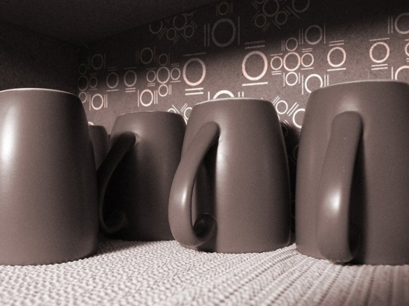
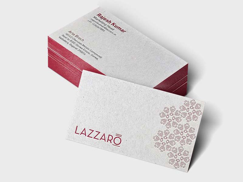
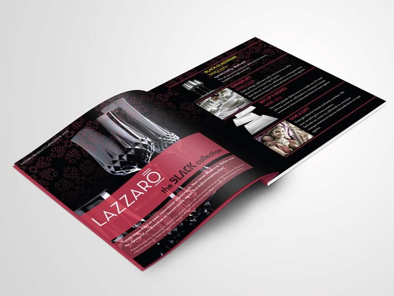
In extension to the name which was Italian, the visual appeal had to be minimalist and classy. A minimalist representation of the dinner plate, spoon, knife and fork, the way it is presented on a table, was incorporated in the logo of Lazzaro’s O. Lazzaro was the amalgam of beauty and utility. The simple yet effective logo achieved just this. The packaging of the tableware brand along with collaterals from print to web were designed to be in vogue, identified by a custom pattern made with the extension of the minimalist cutlery representation of the logo’s O.


Positioning, Brand Name, Brand Identity, Packaging, Communication
