LE VOLT
Brand Concept, Brand Name, Brand Identity
An electrical switch brand wanted to enter the market as a premium label with future aspirations of expanding into related product categories like lights, cables, wires. They wanted to have an international appeal in the market. Hence the name that was decided upon was LeVolt.
As part of the research endeavour, we made site visits on the ground, to talk to the electricians. To understand other target consumers like architects and homeowners we sent in questionnaires which were carefully worded and aimed to understand what factors are taken into consideration when buying a switch. Is price an important component or is it variety in design that attracts the buyer? Is the homeowner at all involved in the process of buying the electrical switch or does he go by the architect’s word?
Insights that came up from the questionnaires and the site visits helped us identify the homeowner and the electrician as the primary influencers.
From our market competition study also we could draw a comparison between the glamourized direct communication of local brands, showing their product range by using the celebrity image and the simplistic and minimal communication of international brands. If LeVolt wanted to expand it needed to decide if it wanted to be a ‘switch-only’ brand or plan to expand.
Establishing a premium electrical switch brand in the market

The preferable place for LeVolt to operate was thus in the space where both the homeowner and the electrician operates and influence buying decisions. There’s a designer in each one of us, paying attention to finer details of life from deciding the patch of colour in the heel of our socks to the monogram we want on our cuff links. The switch is small but it can make a big difference in the way you envision spaces. We wanted LeVolt to be positioned as a core design element in the space of our target audience, rather than trying to fit the switch in the design of spaces.
Going through the visual identities of the key international players and the domestic brands, we took the minimal route. The atom is small but significant just like a switch is. We experimented with the elliptical orbit of the atom, incorporating in the letter V, having rounded and continuous lines. The colour orange was chosen to highlight the V. Orange resonated with the brand ethos of energy and vitality, while also standing out from the reds, greens and blues in the category. Orange exudes a feeling of protection, which is important for an electrical brand to spell out, as security is primary.

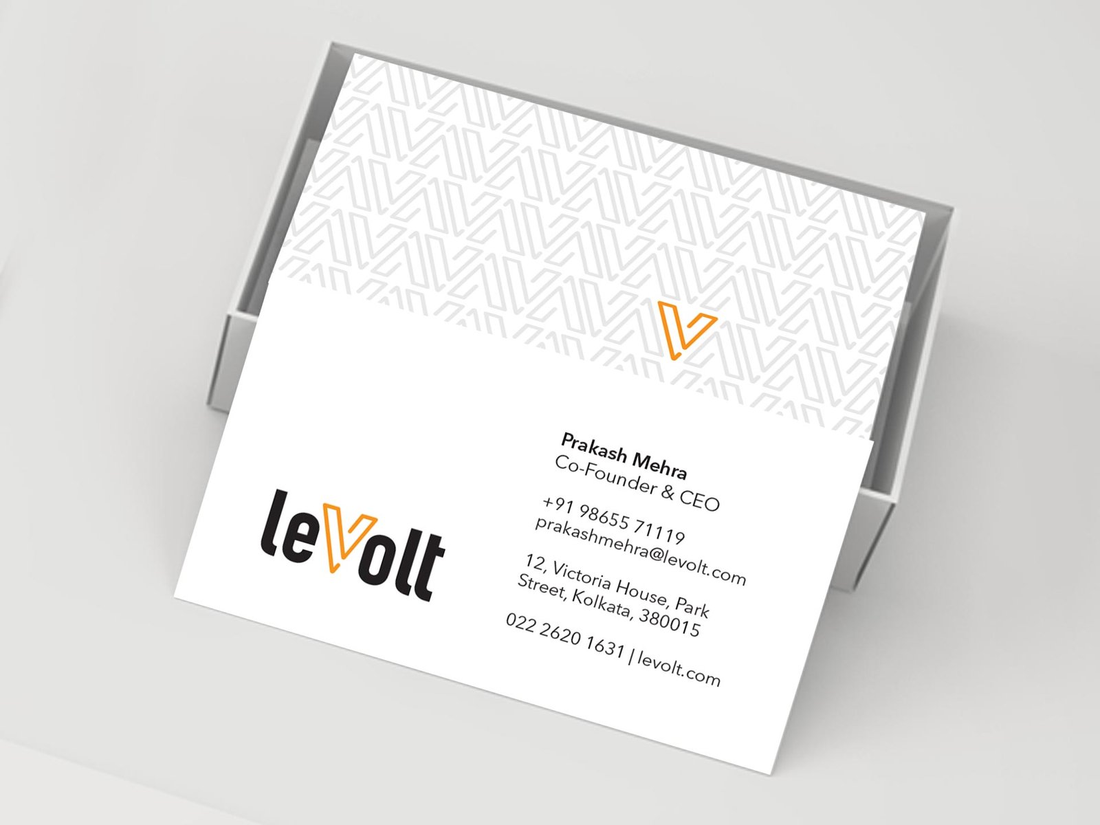
We crafted the typography of the logo in such a way that would work well on an application level. The ‘V’ of LeVolt can be used as a symbol in itself on the switch boards and panels where space is a problem to incorporate even short names. The stationery, packaging and the shop fascia were created to provide a sense of how the brand would look and feel when extended beyond the logo.


Brand Concept, Brand Name, Brand Identity
