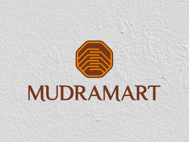
MUDRAMART
Positioning, Communication, Website
CLIENT
Samruddhi Industries is a well-established manufacturer, exporter, importer & supplier of household plastic products.
The company was jointly formed by Mr. Ramakant Malu, Mr. Omprakash Malu, and Mr. Pramod Malu in January 2001. The company is known for their innovation, superior quality and economical price.
BRIEF
The company wanted to create a new market place all together, bringing in a new format of shopping and creating an inventory and supply chain for smaller retailers, home-grown businesses and startups. This would be done by introducing an available inventory of products in the form of a rack with advertisements and gradually a chain of stores with products from such retailers.
The client approached ABND for complete branding solutions which would majorly focus on Tier 2, Tier 3 towns – semi- urban, Kirana stores in and around rural areas and eventually become a giant market place. Brand naming, visual identity, communication collaterals and developing other relevant brand touch points were part of our scope.

Turning a business opportunity into a unique marketplace

Our analysis of the target and competitive landscape helped us identify certain gaps in the market as well as the target group to be addressed. The target group identified was divided into three sub-groups – Retailers, Small and Medium Business Enterprises and buyers in semi - urban areas.
STRENGTHS OF THE COMPANY
Our key learnings were that the professional experience of a large format retailer clubbed with the surprises TV Shopping offers, riding on the warmth and convenience of the neighborhood retailer is what the brand should be about.
The brand naming exercise was guided by two learnings – the name had to be understood as a marketplace and it needed to denote a value that the brand offers. The former learning led to the use of a suffix viz. bazaar, market or mart. The naming criteria involved the usage of Hinglish, which weaved together the aspect of aspiration as well as a connect for the identified target group.

The brand essence crafted was that the brand is a platform that provides equal opportunity by democratizing the marketplace, strengthening businesses and creating unique and valuable customer experiences.

Unity
Joining hands also symbolises coming together of different parts to make a whole
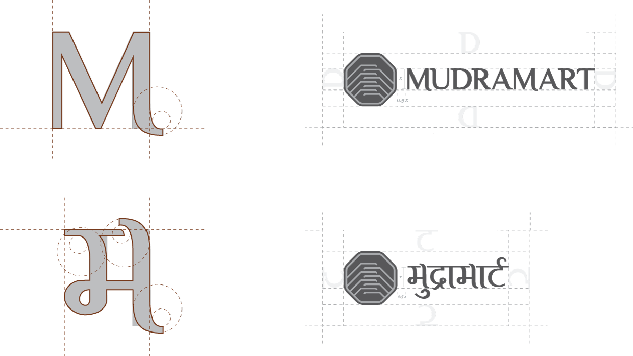
Mudra – Hand Gestures
Various Indian dance forms use Mudras. Each of these mudras represent a human action or sentiment.
Forming a platform or ladder
A form that shows providing an opportunity. A platform that helps one grow
Joining Hands
As a symbol of respect, humility and confidence
The Brand Colors
We wanted the brand to represent its Indian roots and give a feeling of being warm and welcoming

PANTONE 168C
The color represents the trait of being grounded and humility

PANTONE 144C
The color represents fairness and affordability


Brand Identity, Brand Name, Communication
