PRECISION
Positioning, Communication
Precision Plastic Industries Pvt. Ltd. is a pioneer in the field of plumbing and electrical pipes and fittings, being India’s first to introduce the technology of laser engraved pipes. Since its inception in 1978, Precision has set an example of continuous innovation in changing consumer perceptions by adapting to ever growing market needs.
When Precision consulted ABND, the company was already a market leader in the domain of electrical pipes and fittings. However they had an urgency to affirm their positioning as a plumbing supplier. Precision wasn’t sure of their brand identity in the market. In the face of increasing competition and conflicting brand names, they felt the need to rebrand and re-position themselves.
How branding brings unsung heroes out in the open?

Precision was using “Channelize through the leader” as its tagline. We changed it to “Pipes and Fittings” as a logical extension of the name. ‘Precision’ in itself did not provide any insight into the category the company operated in and changing the name of an established brand didn’t seem reasonable. So, spelling out the category in the descriptor made the name more functional.
When working on repositioning the brand, we asked ourselves, “How important is Precision?” If the pipes break, the wires inside will be exposed to moisture and there will be a short circuit. That’s how important pipes are. A house is not a home unless it is lighted and there is access to water. It is just an empty shell. Precision brings water and electricity to every home. From our fieldwork we understood that the electricians ensured that in most buildings it was in fact used.

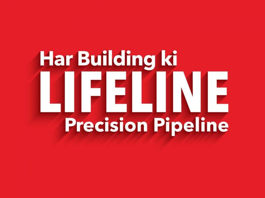
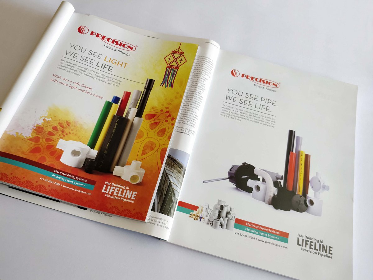
Precision’s sole mission and vision should thus be to be known as the lifeline of every building. So the company motto we developed across communication channels was - “You see Pipe we see Life.” This communication was developed for Tier I cities. Considering the language of the primary target audience in Tier II cities, a Hinglish version was adapted-“Har building ki Lifeline Precision Pipeline.”
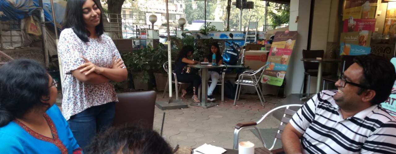
Undergoing in-depth research involving interviews as well as holding conversations on the field, we found out that the electricians and plumbers were people who were making an informed choice about wires and pipes that were being used at our homes. They were the real champions of our cause, of furthering the Precision name. This was a significant learning for the brand as in this category, it is the builders and architects who are usually targeted. But that is not effective targeting as these people rarely take the decisions; they are merely the decision influencers. Precision thus went on to develop its communication specifically for plumbing and electrical meets in Tier I and Tier ll cities. Here, plumbers and electricians were addressed at a personal level.


When deciding the brand colours it was essential to differentiate between electrical fittings and plumbing. Given the colour spectrum of the electricians and plumbers, we had to associate red with electrical goods and blue with plumbing. However, an aqua blue tone was adapted for the plumbing category, to stand out from the competitors. Throughout their brand communication in print, in price lists and brochures, and even while developing the website, ABND maintained the brand colours. To penetrate to the minds of the target group in focus, to catch the attention of the electrician and the plumber, we decided to run Precision radio jingles, having the company’s positioning tagline, in a fairly high frequency. A short film is also being made, featuring the electrician and plumber as the hero of each of our lives.




Positioning, Communication
