RAI
Rebranding, Brand Positioning, Brand Identity
RKKR Steel is a diversified and strategic business group dealing in steel across geographies. But the need was to expand across industries. The intent wasn’t to take away anything from the aspect of RKKR; it was in fact to retain the legacy and trustworthiness while making way for multifaceted agility and dynamism across industries. The brand architecture thus called for a redevelopment. Their visual style also had to be modern, smart, technologically and industrially driven.
In order to kick-start the process it was essential to conduct various brand workshops to understand the competitor’s strengths and weaknesses as well as the target audience’s mind-set. Also this was necessary in comprehending the stakeholder’s vision along with every department’s views on the existing brand.
Diversifying beyond steel, how do you retain legacy while being agile?


After much deliberation and research on our part, RKKR made the simple conversion to ‘RAI’ as that was the name people would often use when referring to this family group brand. Also, due to partnership reasons, RKKR insisted on renaming themselves. The new brand RAI emerged, which stood for being grounded by values and at the same time driven by change.

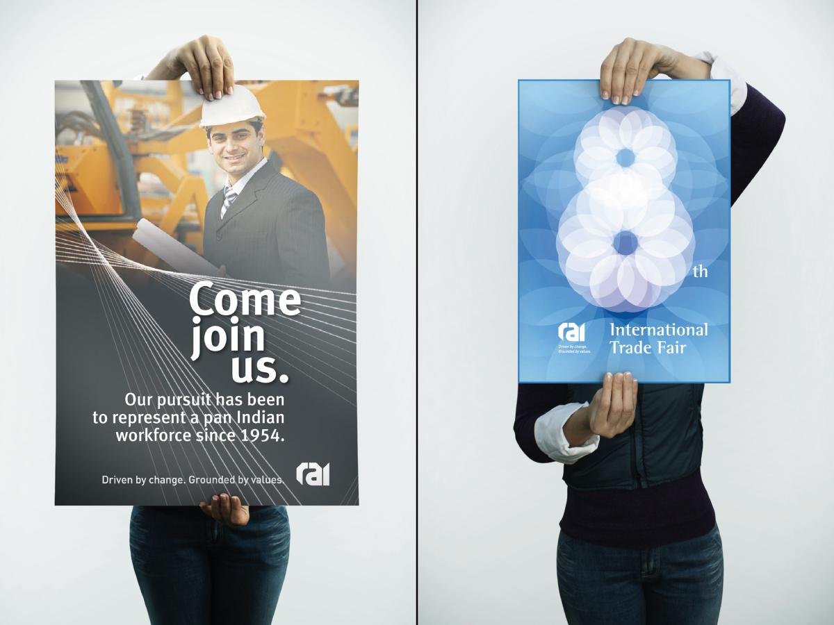
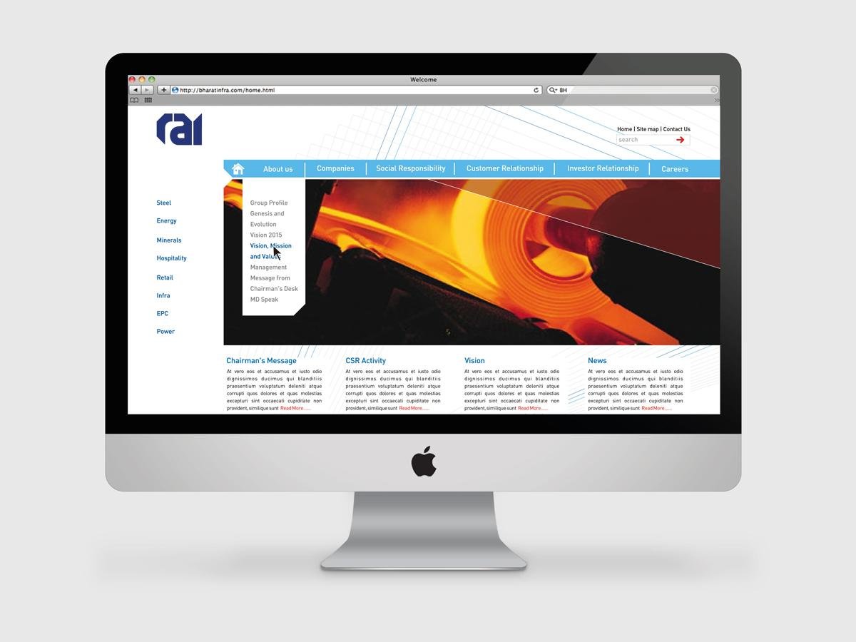
The boldness of the new RAI logo was maintained through all other print and web collaterals, representing reliability of experience and agility of mind. The newsletter was also named by ABND as “Driven by Change.”


Rebranding, Brand Positioning, Brand Identity
