RIDLR
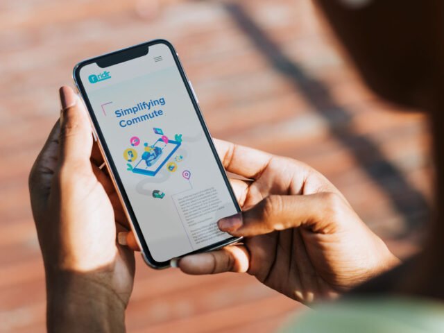
Positioning and Website Design
CLIENT
Ridlr is an Indian public transport commuting and ticketing app. Ridlr was introduced in India in 2012 by Bird’s Eye Systems Private Limited for Delhi and Mumbai. In April 2018, it was taken over by Ola.
BRIEF
When Ridlr approached ABND, there were having a difficult time communicating their B2B offerings to new clients in the industry. It was predominantly known as a ticketing platform due to their B2C exposure. The main challenge for ABND was to create a unique brand positioning that highlights their services which appeal to the B2B2C space. Additionally, a clear communication strategy and refreshed website was essential to highlight their technological advancement.
Repositioning a next generation transit solution partner
What is Ridlr?
Primary Target
Audience
Secondary Target
Audience

The main aim was to ensure to that the use of private transport becomes obsolete.
To craft a unique positioning for Ridlr, it was essential to understand the level of awareness that Ridlr held in the market. Through our research, we identified that the consumers who knew of Ridlr, heard about it due to its Ola acquisition or due to its ticketing services. Additionally, the customer base using public transport was comparatively much lower due to lack of convenience, traditional systems and depleting infrastructure. Hence, Ridlr needed to focus more on their B2B communication, providing technological advancements to agencies in the public transport sector and thereby increasing its usage. The main aim was to ensure that the use of private transport becomes obsolete.
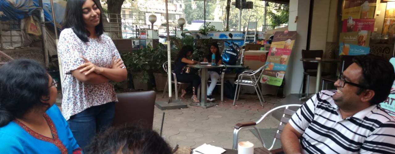
We also analysed the experience of the sales team, identifying communication gaps and common queries of agencies. This helped us to craft key pieces of communication for Ridlr across all touchpoints. Agencies looked at Ridlr only for a particular product or service. Rather, Ridlr needed to be projected as a technological solution provider which provides customized solutions depending on the need. Additionally, Ridlr being technologically driven, they understood the changing environments and had a mobile first approach, which could then be adapted on other mediums.
For this purpose, the following positioning was crafted

We all live in cities where majority of our time is spent in travelling. Hence, we also established that Ridlr needed to go a step ahead and focus beyond the concept of smart cities, but rather on smart transit.
Smart Transitfor EVERY CITY
Our process

Workshops

Analyzing Data

Information Architecture

Identifying Key Elements

Wireframe /UI/UX

Development

Approach
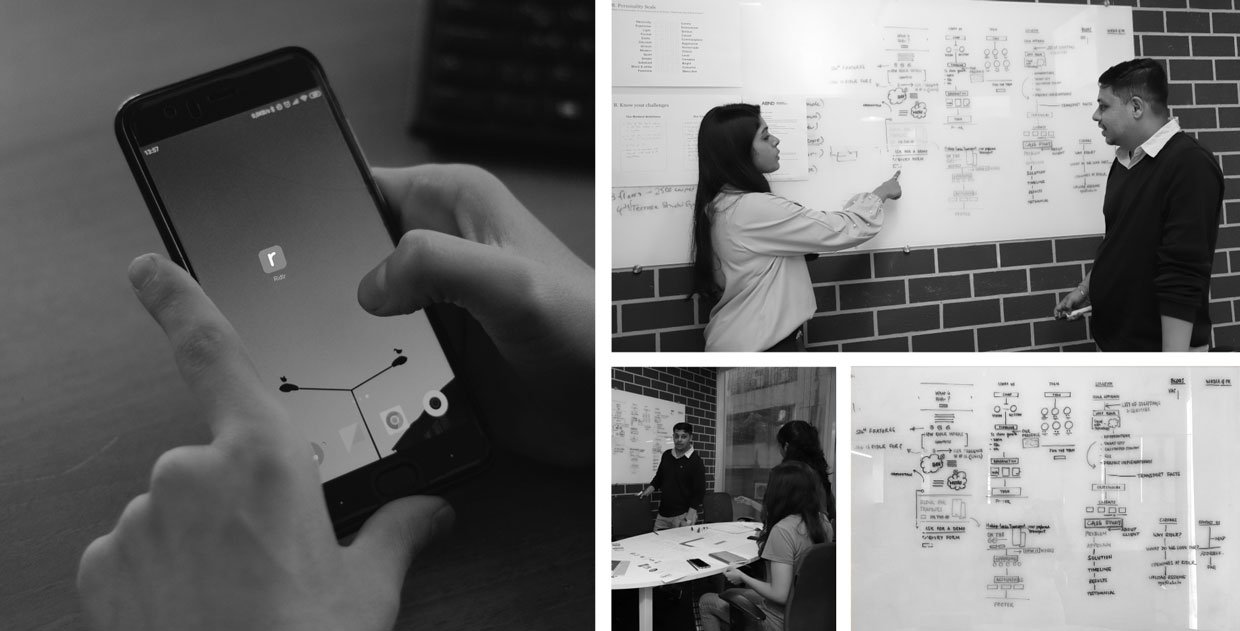
The brand personality was identified as the exciting creator, one who is an outdoor enthusiast and is constantly looking for new innovations to make life convenient. Based on this, we chalked out the information that the target audience needed to do with respect to Ridlr. An intense brainstorming session with the strategy, design and development team led to the materialization of a wireframe that suited both the B2B and B2C audience. Additionally, the brand tone of voice was kept humorous yet knowledgeable and in first person. This was to ensure that the appeal of the brand stayed 21st century and modern, and gave a human touch to it.


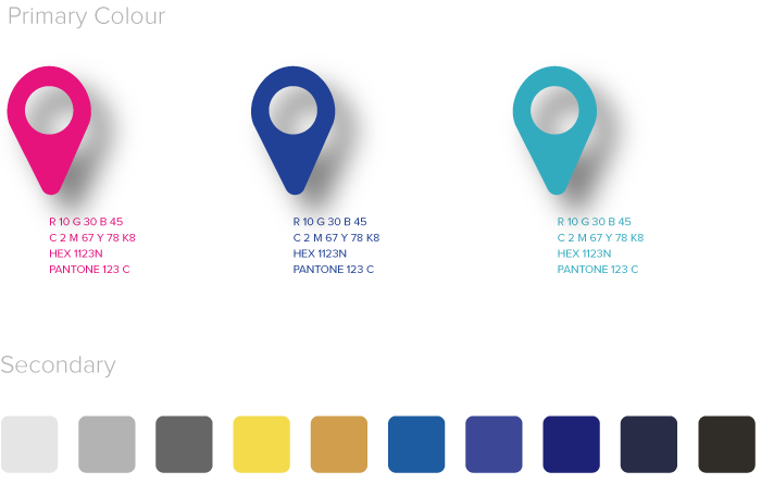
Colour Scheme
The colors were selected keeping into mind a modern day exploratory personality while focusing on technology and innovation.
