SAGAR WORLD
Brand Concept, Brand Identity
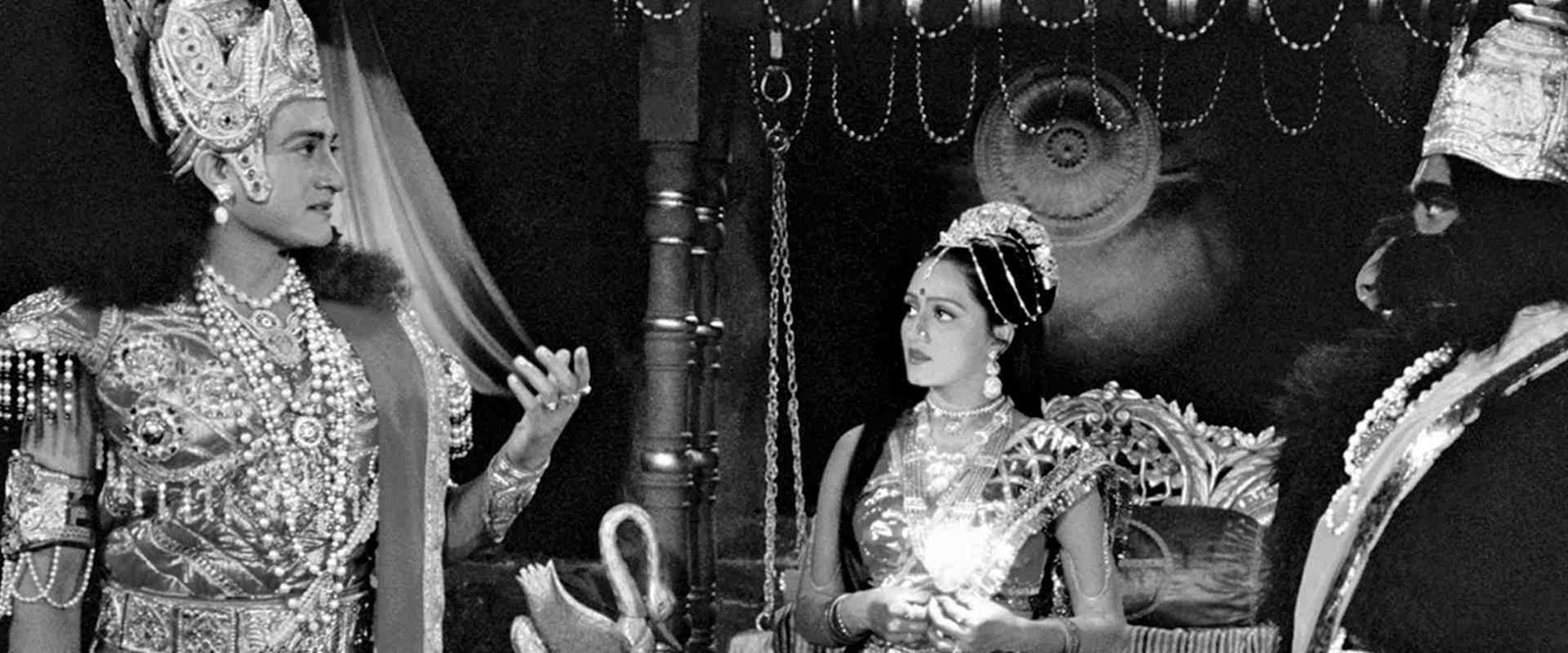
Sagar Arts wanted to establish a group company brand that would act as a mother brand to their numerous initiatives. The objective was to understand the history of Sagar films, their existing brand architecture and all the possible additions in future. Retaining the traditional roots of the Sagar legacy was primary. Considering this, we decided to go ahead with the name ‘Sagar’ with the word ‘World’ to capture the essence of a big umbrella group company.
Our role was clear: Build a strong and differentiating brand that could grow with this ever-evolving business and take it forward.
Building the mother brand for integrating a production house having a rich legacy


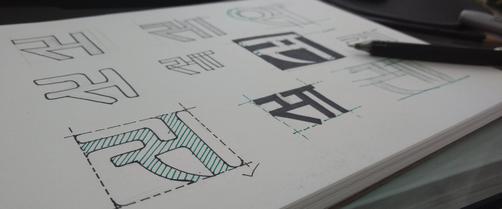
For a company with a rich legacy behind it of creating mythological tales on the small screen, it was imperative to explore the logotype keeping in mind traditional imageries of the conch shell, lotus, sun etc. Later we went on to representations in ink, calligraphy and various pencil and paint shades.
To write ‘Sagar, considering the traditional Hindu rootedness of this company. Modern typography was also used blend tradition with the contemporariness of a group brand.
The inspiration behind the logo came from the word “Sagar,” which means ocean. The ocean in traditional Hindu mythology is depicted to be a parallel universe of indefinite mysteries and endless possibilities. Thus, taking up the imagery of the sea would be in sync with the existing name and it would bring out the scale of a group brand company as well.

To bring out the colours of the ocean, we played with multiple shades of blue with a wash of water. Exploring the various patterns and movements of the watercolour set a perfect backdrop to the logotype. With the prominent blue water wash of the mother brand, we fused watercolour shades of pink, green and yellow for Sagar World Films, Multimedia and Television.


Brand Concept, Brand Identity
